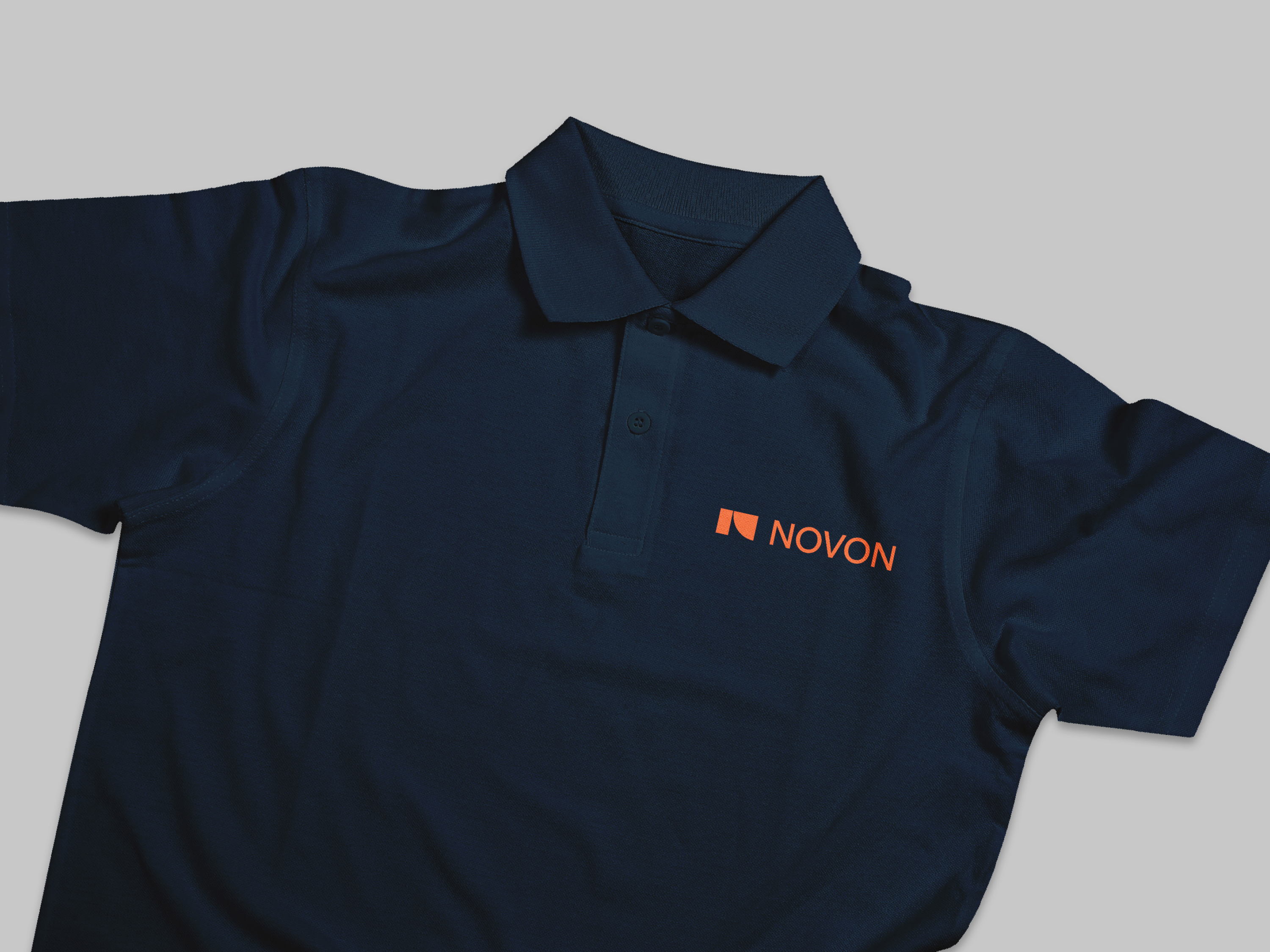
Novon
Novon
Novon are an Australian-owned lighting innovator with the mission of connecting people to spaces.
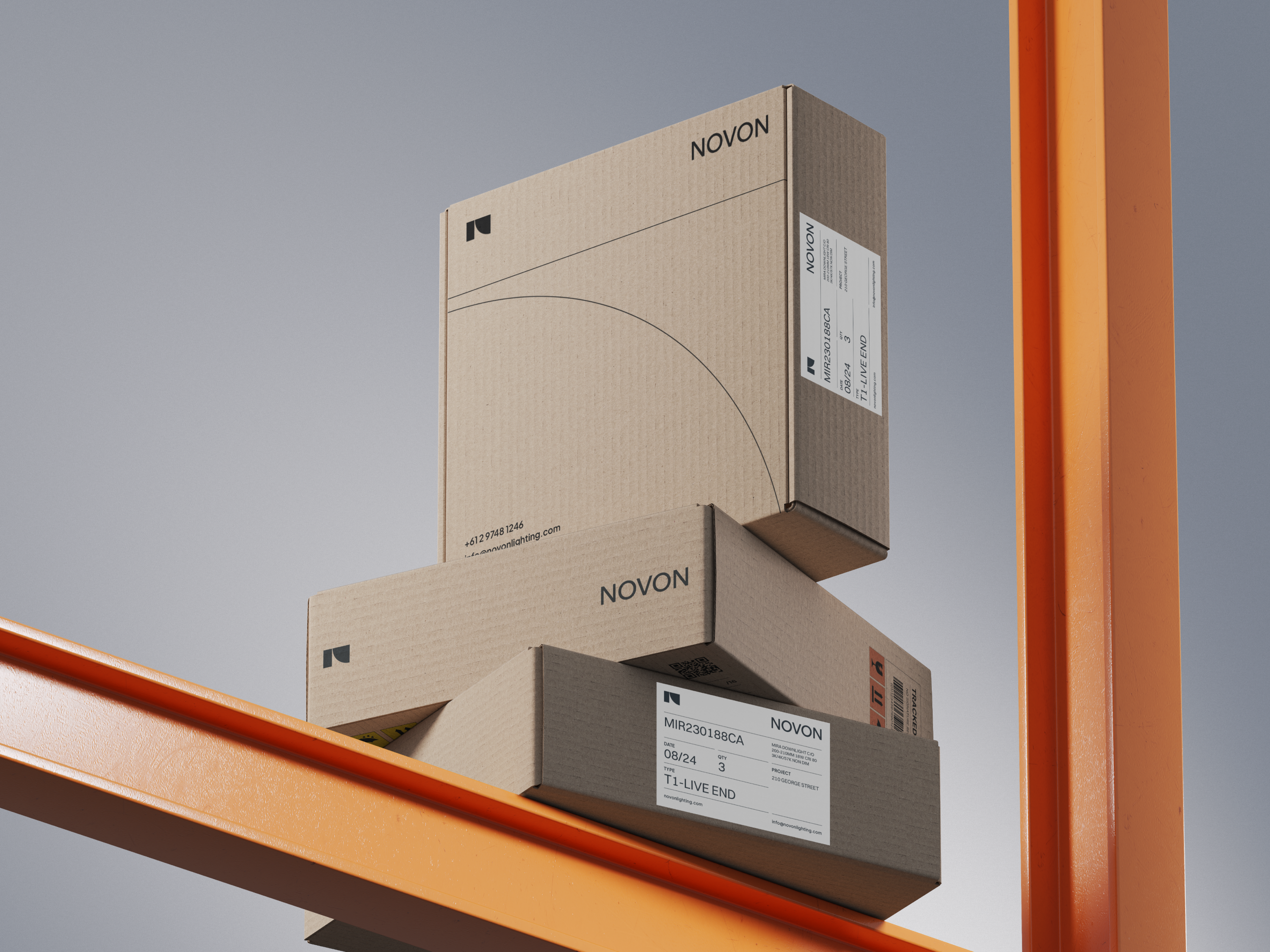
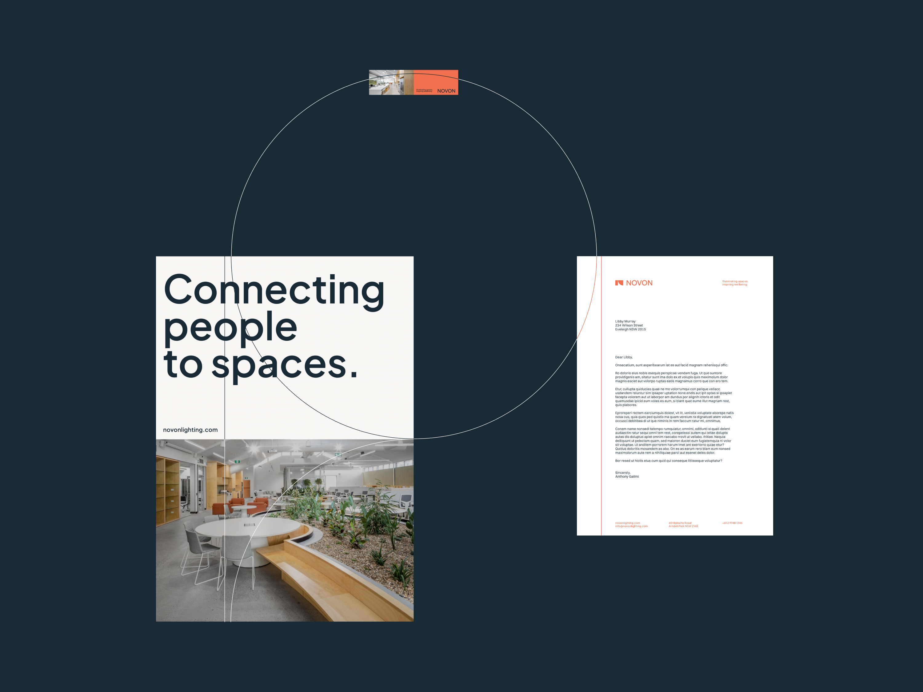
Our team was tasked with rebranding the business to reflect their updated vision. The process begun with the creation of a new name and followed through across all aspects of the brand including language, photography direction, packaging design and iconography sets.
Read moreNovon
Novon
Novon are an Australian-owned lighting innovator with the mission of connecting people to spaces.
Our team was tasked with rebranding the business to reflect their updated vision. The process begun with the creation of a new name and followed through across all aspects of the brand including language, photography direction, packaging design and iconography sets.
The name Novon is a fusion of ‘Nov’, the Latin root word meaning ‘new’, and ‘on’ which symbolises Novon’s commitment to ongoing innovation. The palindromic nature of the word reflects their dedication to sustainable manufacturing through embracing circularity, using locally sourced materials, and minimising waste.
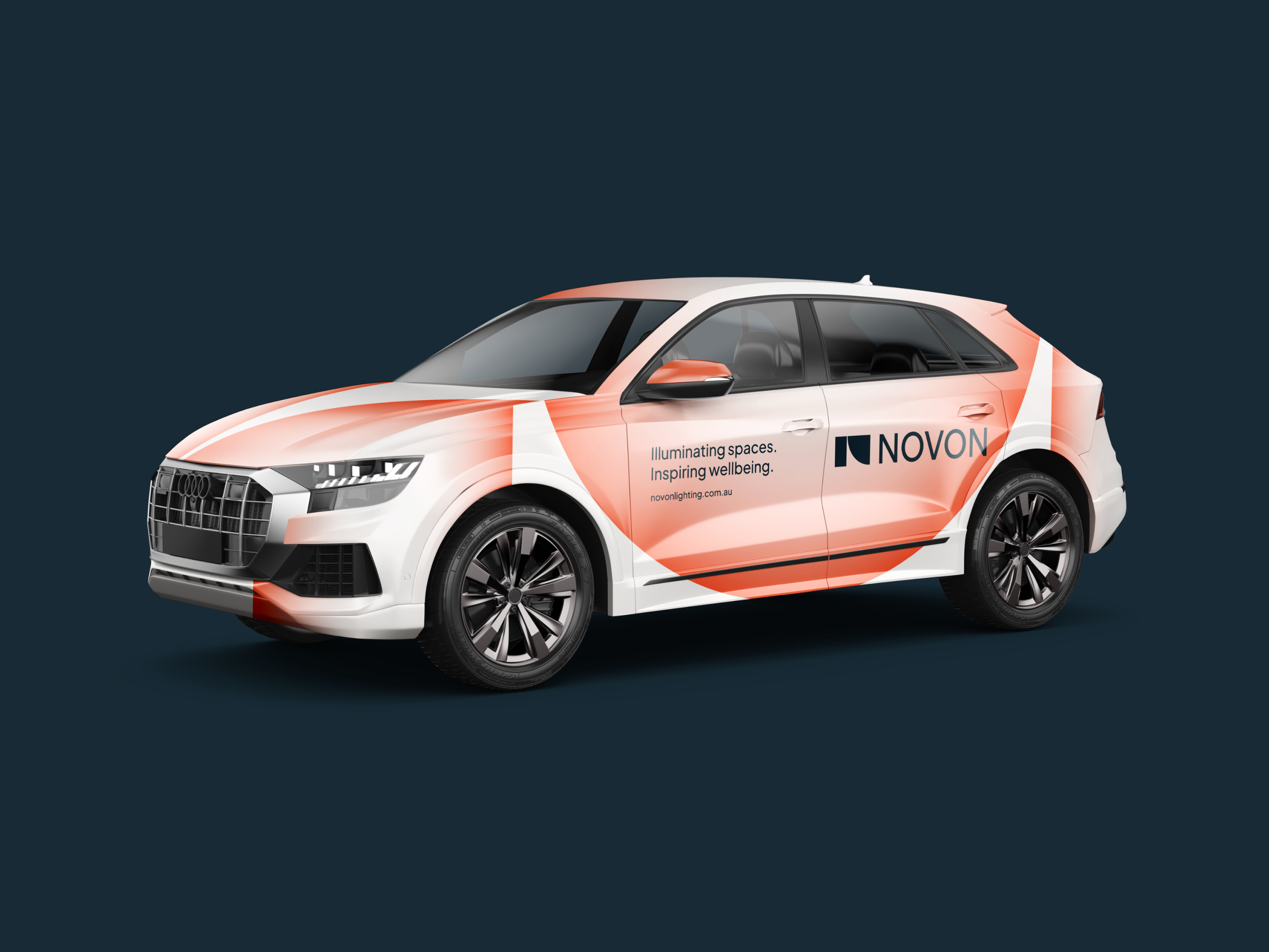
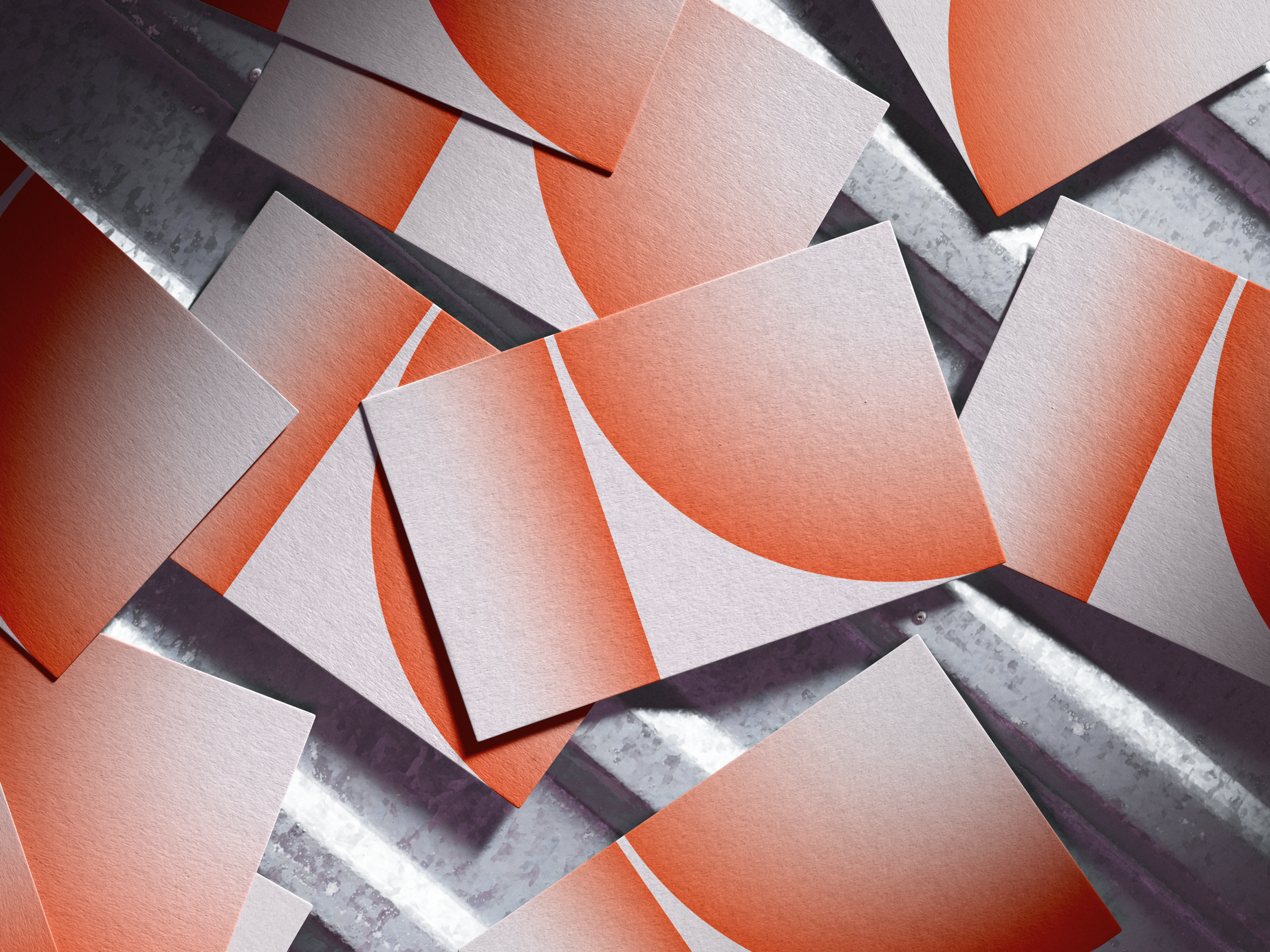
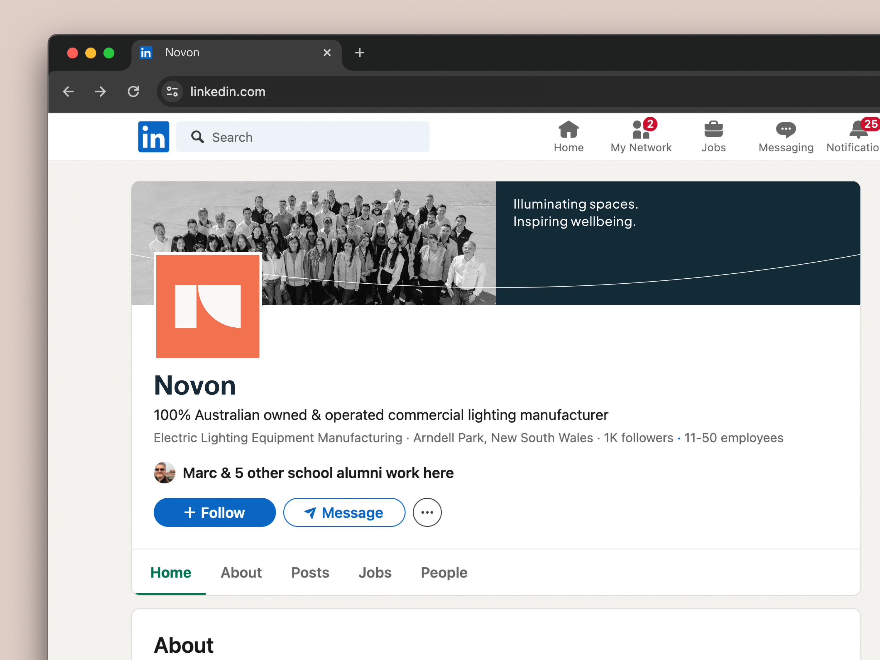
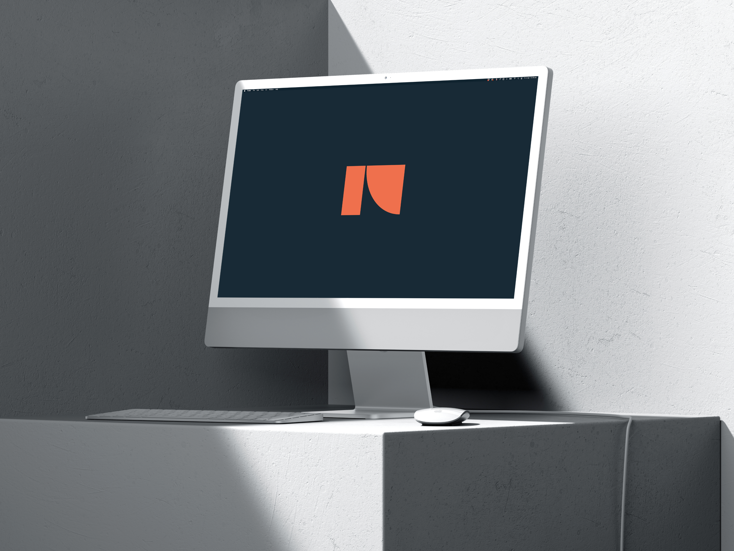
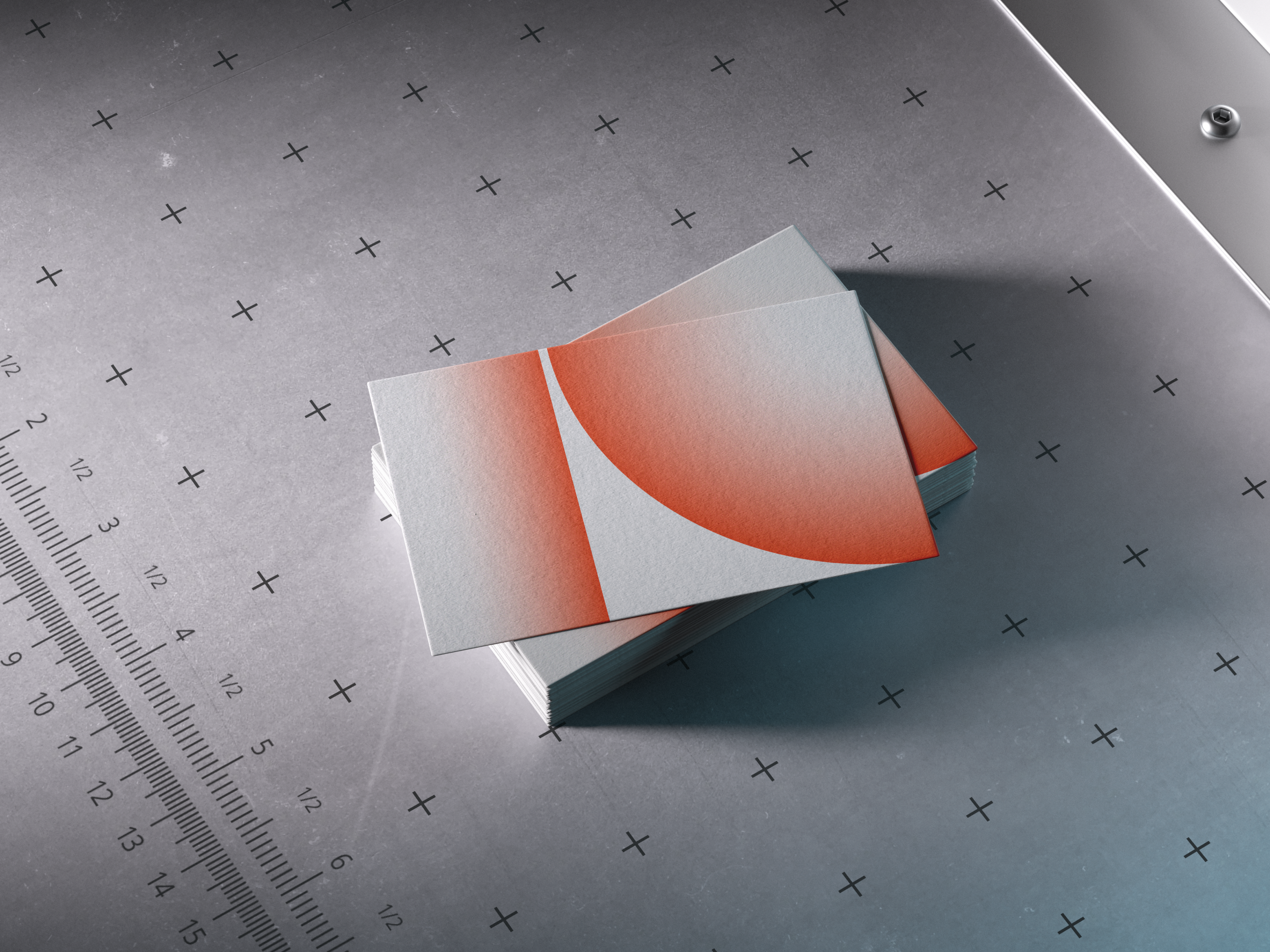
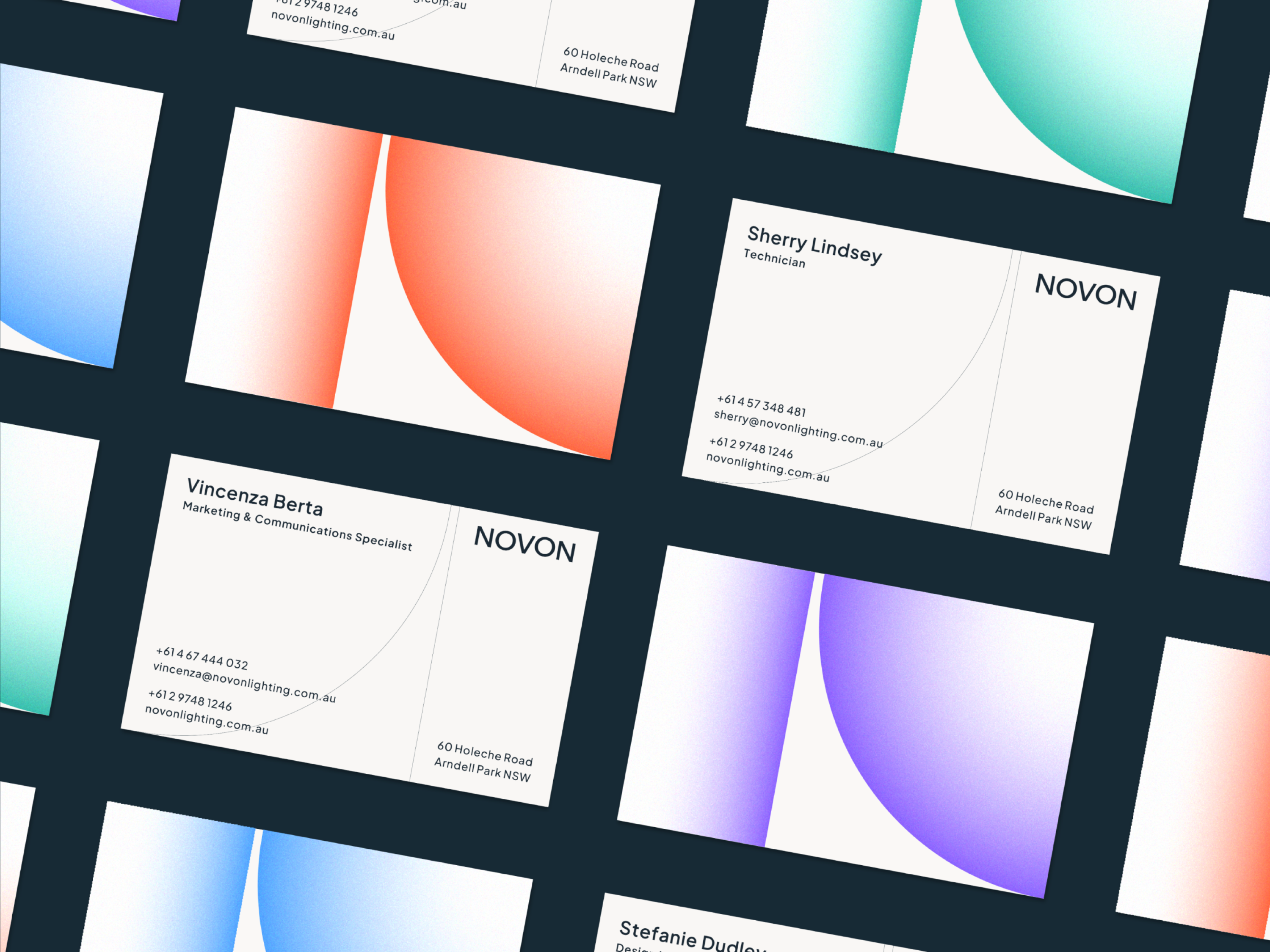
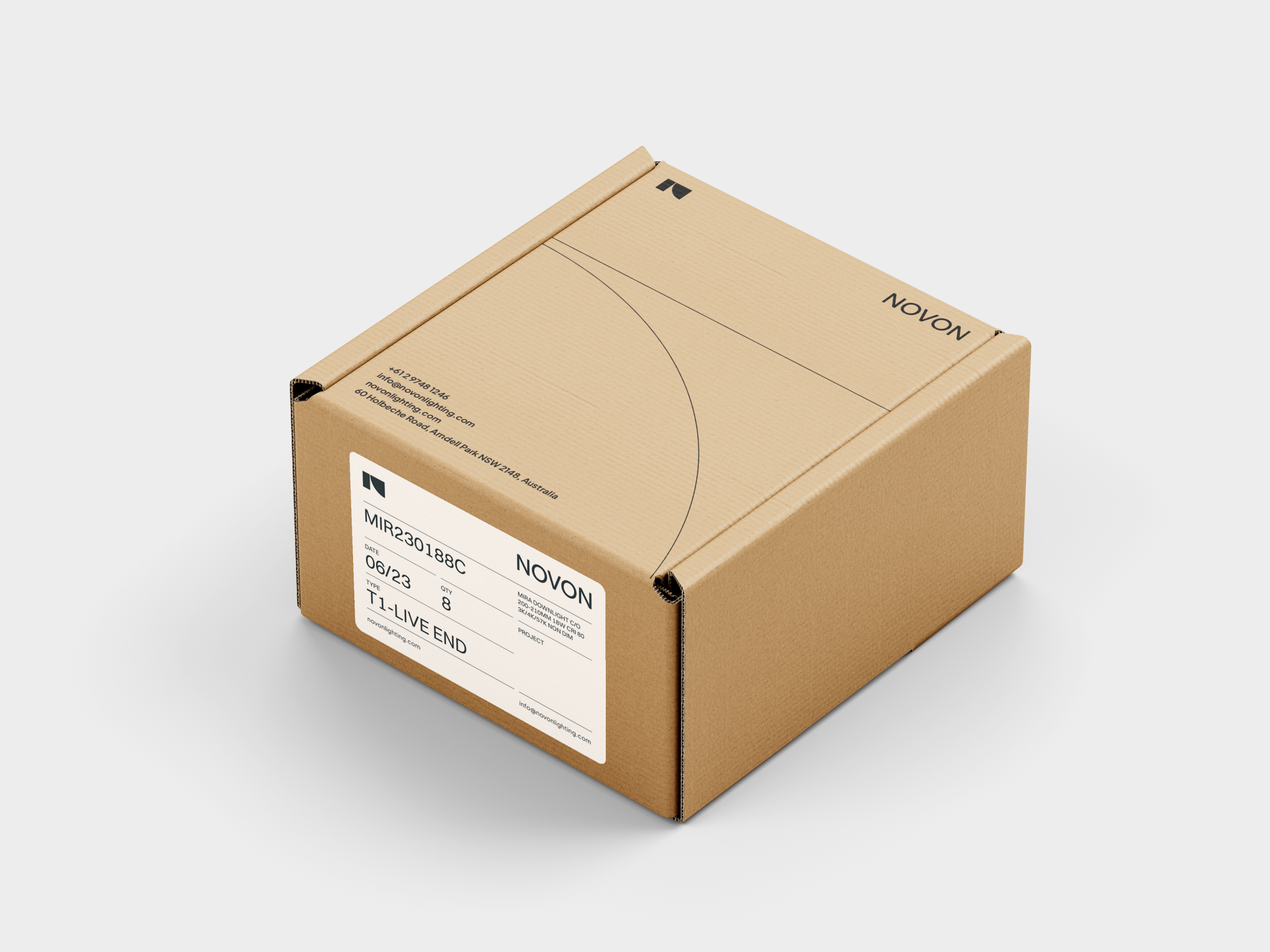
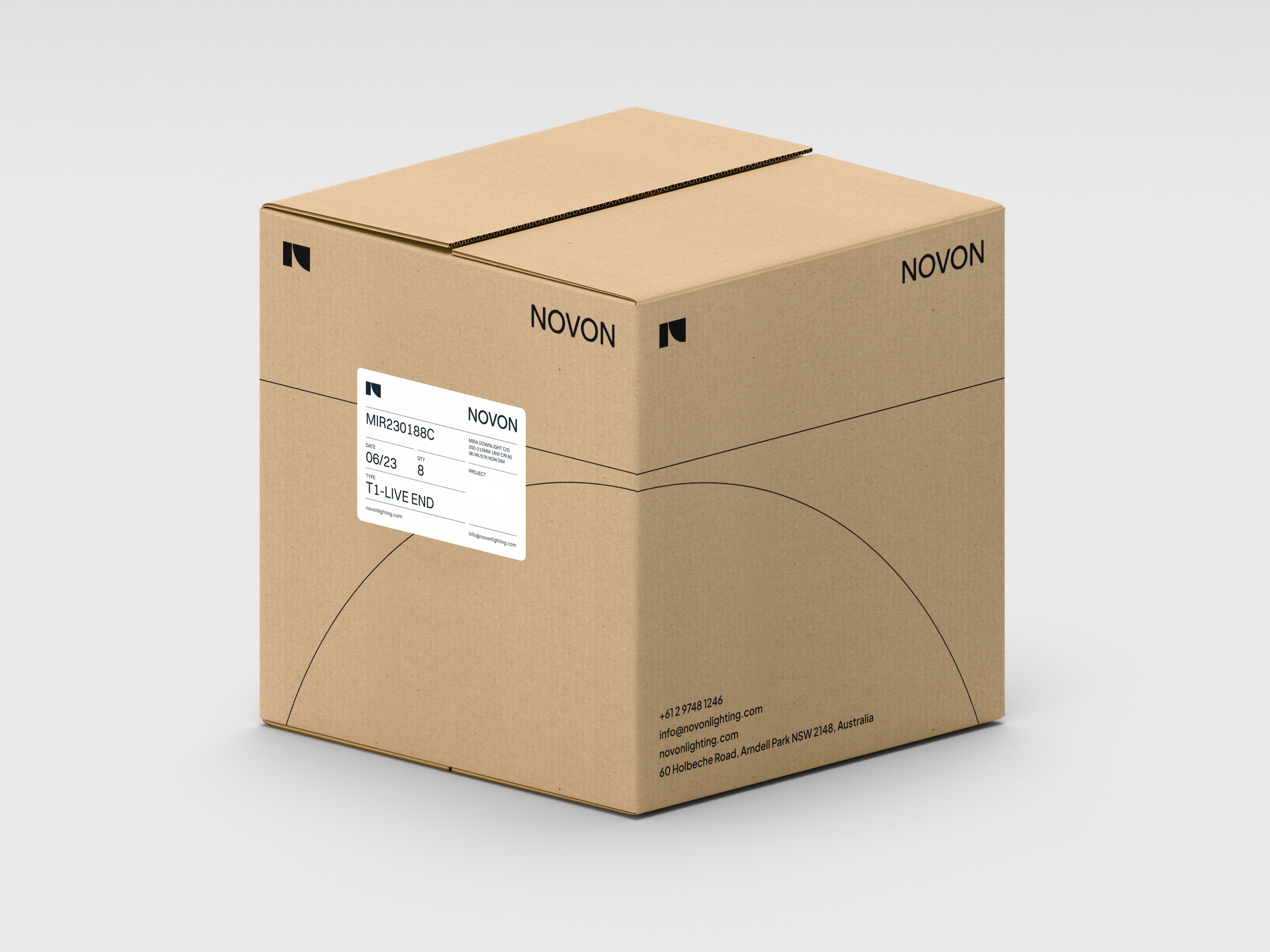
The bold yet approachable mark combines two geometric shapes which subtly form an N. Novon’s commitment to building the pathway to a brighter tomorrow is communicated through the use of negative space between the forms which suggests a pathway leading upwards.
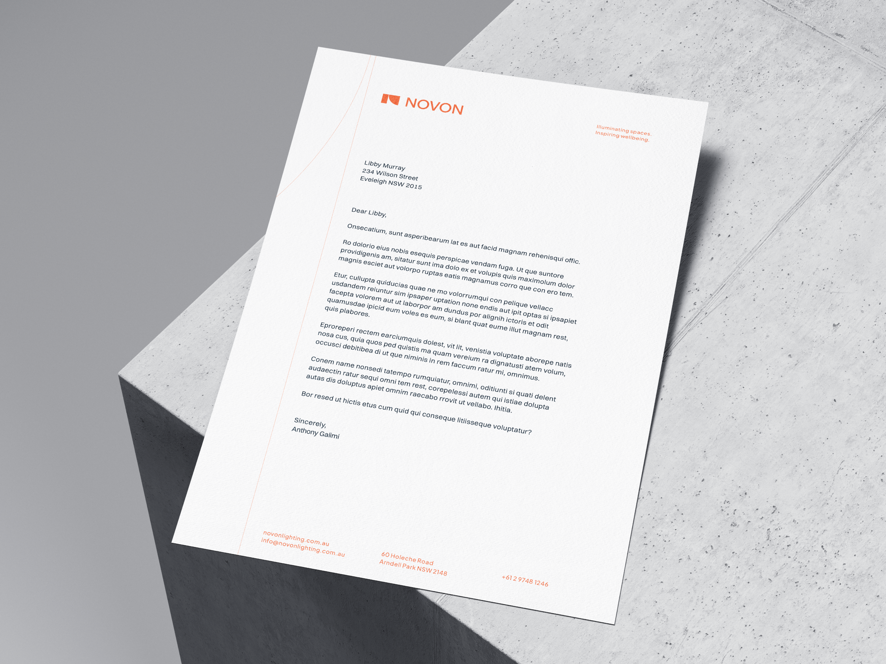
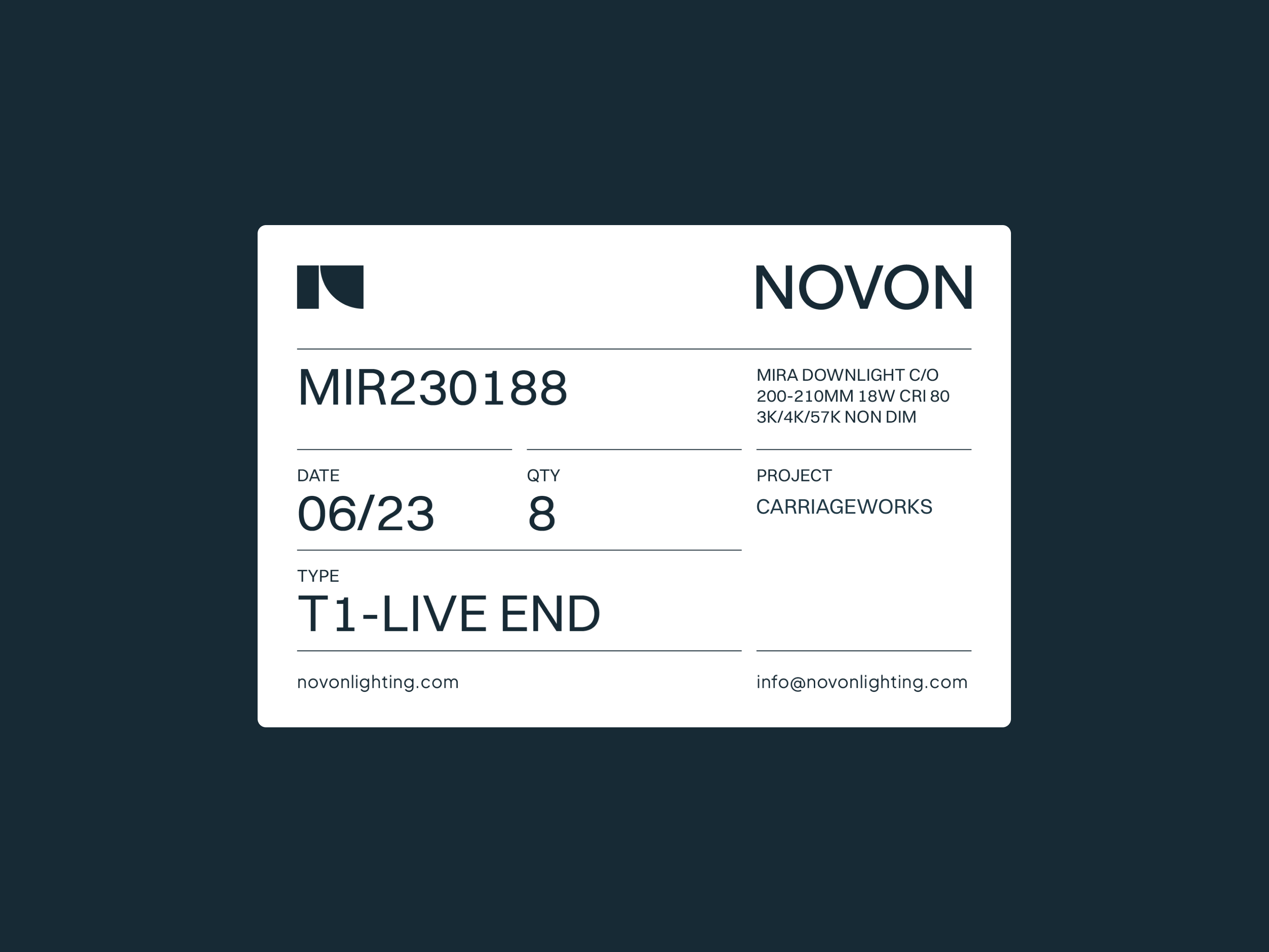
Throughout the brand, curved and straight grid lines create lightness on the page in contrast with the bold typography. They reference the geometric forms in the logomark as well as visual language found in technical drawings.
The bold colour palette was selected to position Novon as both trustworthy and a leader in its field. Primary and secondary colours are combined with white to create illuminating gradients. These can be applied across layouts to fill areas within grid lines as a way of visualising spaces being illuminated.
Novon makes use of two different font families to create its unique brand personality. Plus Jakarta Sans is a geometric sans serif. It’s unique features and rounded shapes mirror the forms found in the logo. We paired it with Switzer which is a neo-grotesk sans serif for easy reading across print and digital applications.
Services:
Branding,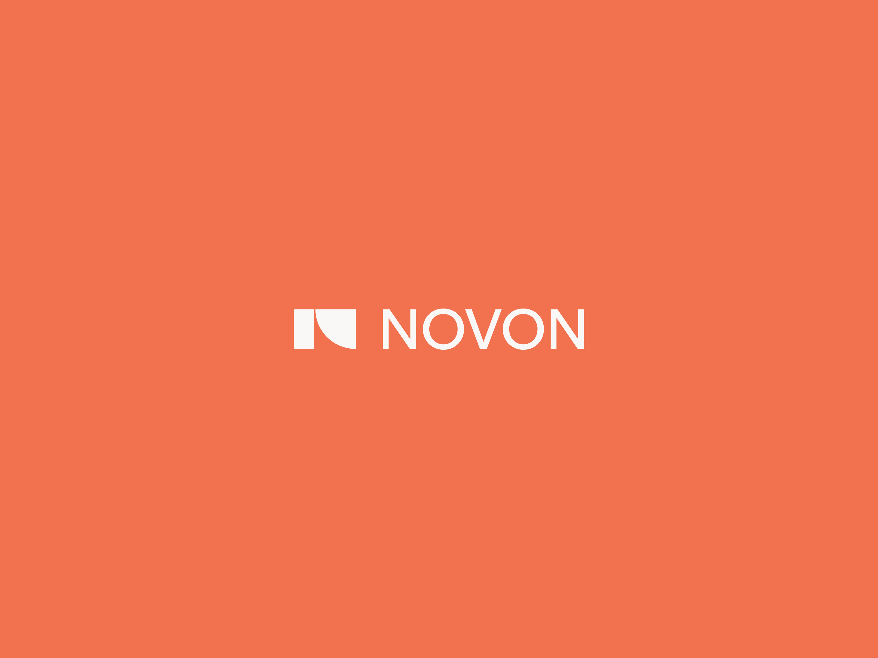

Building Blocks for Wayfinding Icons
Wayfinding Icons

Brand Value Posters

Brand Posters


Application Icons
Application Buttons
Grid Lines