Brand Identity
Bright
Bright is a wellbeing platform that offers powerful tools to help people make informed choices about their food and health.
Our team was tasked with creating the platform’s brand identity and marketing campaign.
The logo mark communicates bright as a guide on your personal journey to wellness. Taking visual cues from the notches on a compass and a graphic burst of light, the resulting mark communicates and builds upon the start-up’s mission.
Read moreBrand Identity
Bright
Bright is a wellbeing platform that offers powerful tools to help people make informed choices about their food and health.
Our team was tasked with creating the platform’s brand identity and marketing campaign.
The logo mark communicates bright as a guide on your personal journey to wellness. Taking visual cues from the notches on a compass and a graphic burst of light, the resulting mark communicates and builds upon the start-up’s mission.
As the platform has such a diverse range of functions, from nutrient tracking to food ordering, the identity needed a flexible colour palette. We chose a colour palette inspired by naturally bright food tones, including greens, purples, and pinks, to evoke a sense of playfulness.
With the typography, we chose a headline font to communicate the friendliness and approachable nature of the brand. We paired it with a minimalist sans-serif font for easy reading in print and digital applications.
To ensure consistency and flexibility across all touchpoints, we created a modular layout system that can adapt to various screen sizes and content types. The system includes detailed guidelines for logos, typography, colour usage, graphic language, and tone of voice.
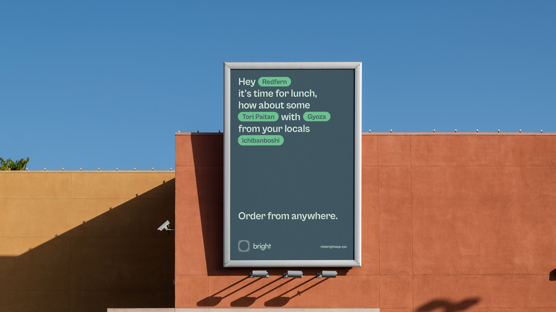
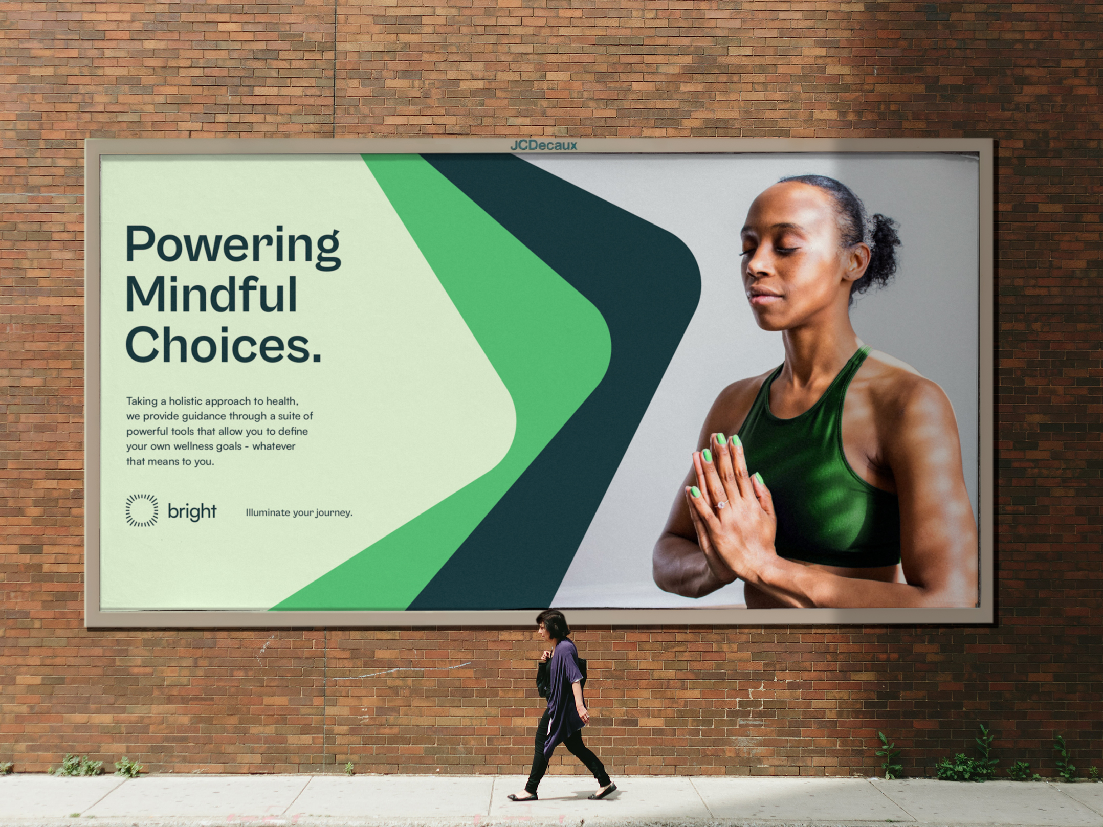
We developed a suite of headline options for the marketing campaign to demonstrate that a balanced, happier lifestyle starts with mindful choices. Bright empowers users to make more informed choices and order thoughtfully.
Services:
Branding, Campaign,
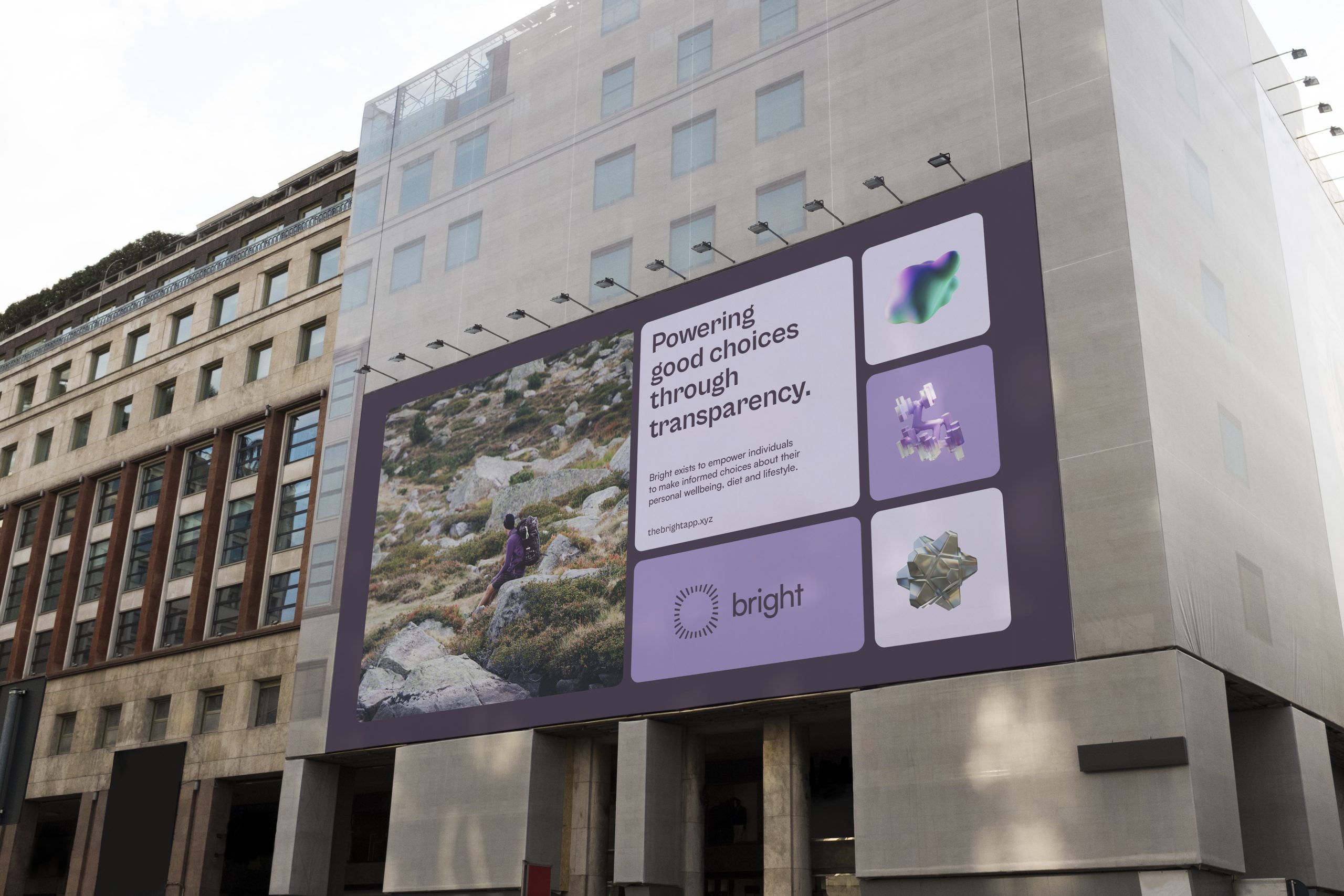
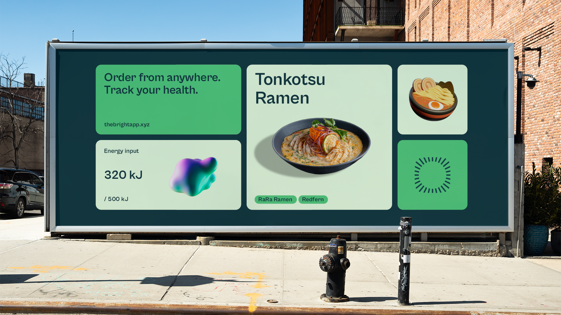
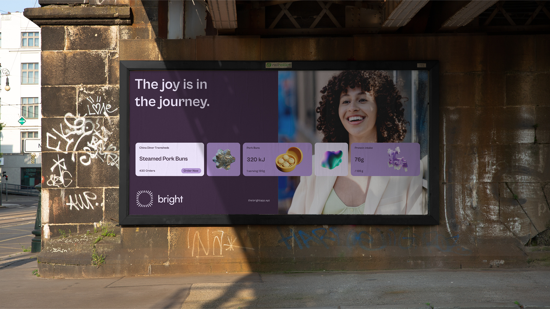
We created a modular layout system to ensure consistency and flexibility across all touchpoints.
Our goal in developing the modular layout system was to ensure that the identity was grounded in the app’s functionality. By directly referencing the platform’s user interface through stacked rounded modules and other in-app features, marketing outputs become more grounded in actual use cases.