Future of Finance
Block Earner
Powered by blockchain technology, Block Earner dramatically outperforms traditional finance. We helped launch their exciting new Yield Account product into the world through a multi-phase strategic campaign.
This campaign contained different artwork and messaging for each phase. We strategically designed each creative to resonate with a specific demographic and take the viewer on a journey towards opening an account with Block Earner.
Read moreFuture of Finance
Block Earner
Powered by blockchain technology, Block Earner dramatically outperforms traditional finance. We helped launch their exciting new Yield Account product into the world through a multi-phase strategic campaign.
Powered by blockchain technology, Block Earner dramatically outperforms traditional finance. We helped launch their exciting new Yield Account product into the world through a multi-phase strategic campaign.
This campaign contained different artwork and messaging for each phase. We strategically designed each creative to resonate with a specific demographic and take the viewer on a journey towards opening an account with Block Earner.
Awareness
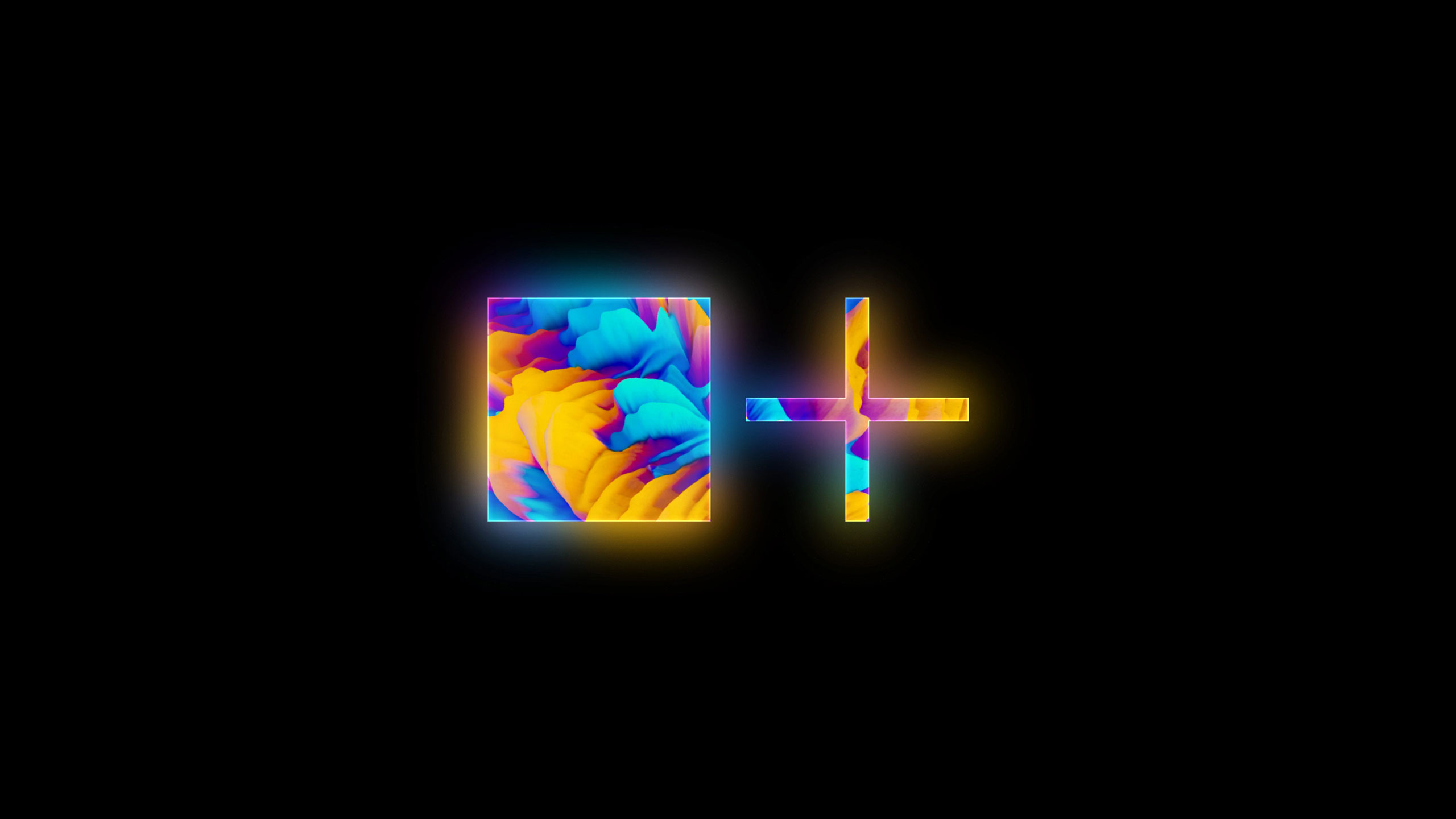
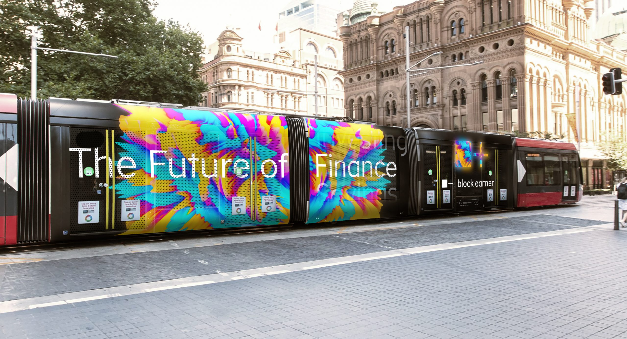
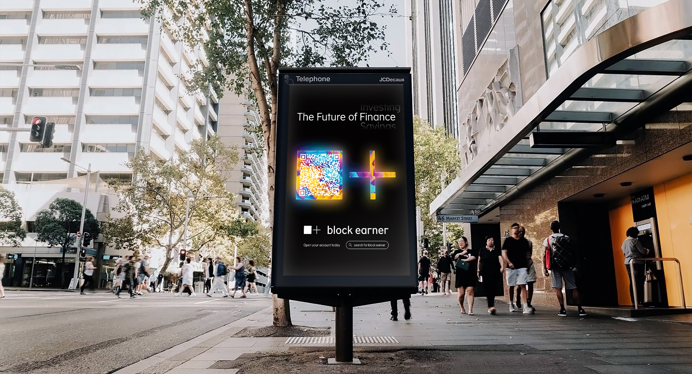
We created bold graphics that reflect the digital world to launch this futuristic, blockchain-based product into a market oversaturated with heritage and dull brands. This phase of the campaign launched the Block Earner brand into the forefront of the minds of metropolitan Sydney-siders through tram and bus wraps and large format out of home print advertising. This phase was also brought to the small screen through in-game mobile, social media and digital display advertising.
Engagement
We created multiple creatives to playfully poke fun at the interest rates that people receive with traditional finance. Numerous messages and artwork were developed for this phase, targeting users familiar with the Block Earner brand. This phase appeared on screens all over Australia through in-game mobile, social media and digital display advertising.
Conversion
We developed the final phase of the campaign to encourage users to create an account. We combined action led messaging with lifestyle imagery. Various images containing a range of age groups were curated and served to the appropriate demographics – ensuring the ads best resonated with the viewer. This phase appeared on screens all over Australia through in-game mobile, social media and digital display advertising.
Website
We also designed a range of assets to bring the awareness campaign aesthetic to the website, communicate the benefits of the Yield Product and provide eye candy through animation.
In conjunction with the multiple concurrent campaigns running simultaneously, we also helped develop a seamless experience for the customer. We created different landing pages for each phase of the campaign, so when a user clicked on an ad, the hero creative of the ad would match the first piece of creativity they saw on the website. This extra step in design helped create a mental handshake between the ad creative and the website giving the user assurance and limiting confusion.
Services:
Campaign, Creative Direction, Design, Digital,

A Black Sheep
We created bold graphics that reflect the digital world to launch this futuristic, blockchain-based product into a market oversaturated with heritage and dull brands. This phase of the campaign launched the Block Earner brand into the forefront of the minds of metropolitan Sydney-siders through tram and bus wraps and large format out of home print advertising. This phase was also brought to the small screen through in-game mobile, social media and digital display advertising.
Read more

Awareness and Engagement Social Ads
Website
We also designed a range of assets to bring the awareness campaign aesthetic to the website, communicate the benefits of the Yield Product and provide eye candy through animation.
In conjunction with the multiple concurrent campaigns running simultaneously, we also helped develop a seamless experience for the customer. We created different landing pages for each phase of the campaign, so when a user clicked on an ad, the hero creative of the ad would match the first piece of creativity they saw on the website. This extra step in design helped create a mental handshake between the ad creative and the website giving the user assurance and limiting confusion.
Block Earner Homepage
Block Earner Homepage
Yield Account Page