Pasta Wafu
PW Dining
An explosion of flavour.
Pasta Wafu approached us with the challenge of creating a unique brand identity that would seamlessly blend the cultures and flavours of Italy and Japan. The goal was to create a brand that was both friendly and exciting, standing out in an increasingly crowded marketplace.
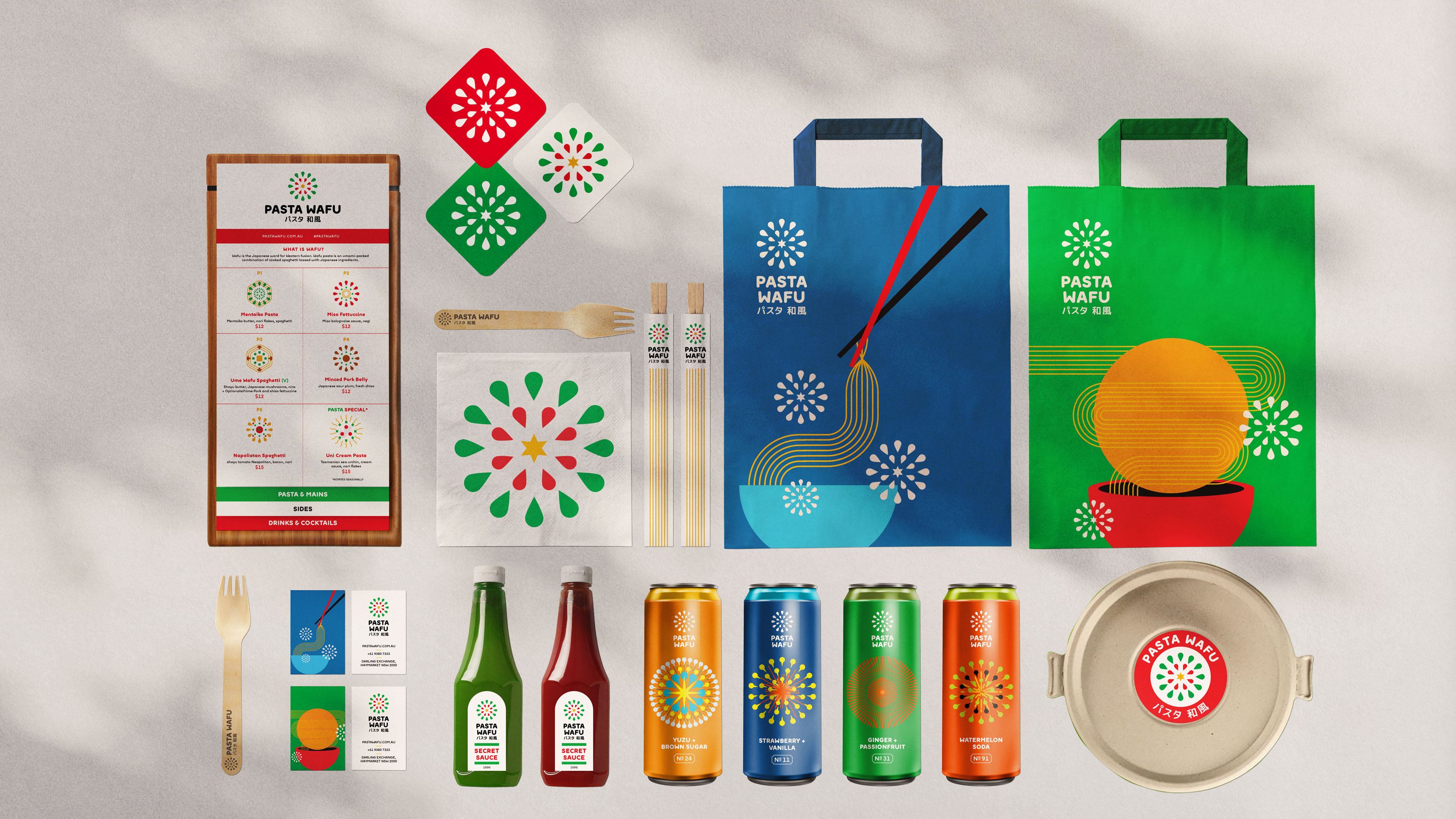
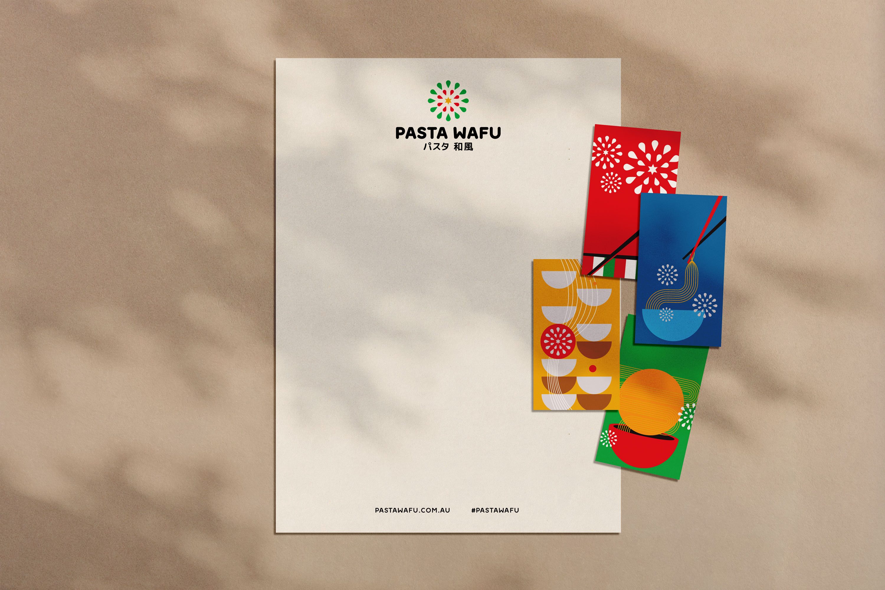
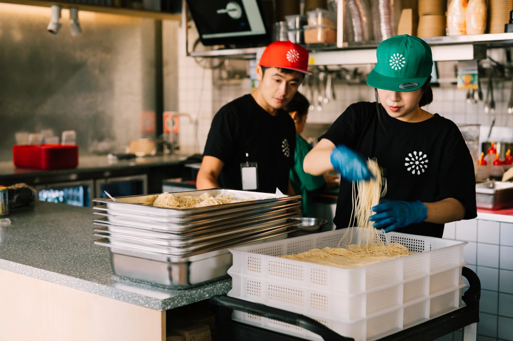
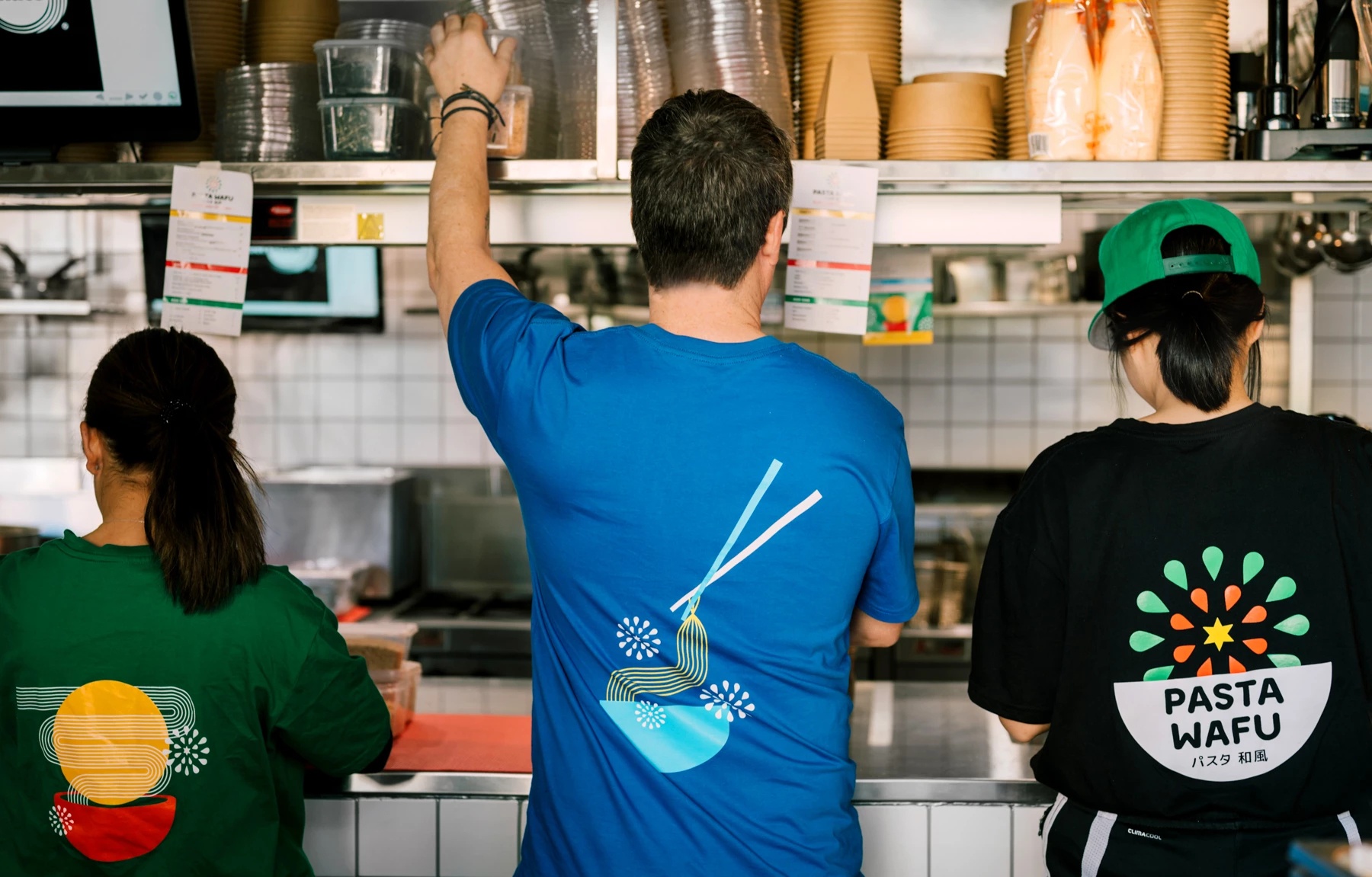
Our team embarked on a comprehensive branding project that included designing a brand identity and executing an application rollout. The rollout involved creating various physical and digital assets, such as signage, menus, uniforms, merchandise, and packaging. We also developed an animation to help communicate the brand’s unique identity effectively.
Read morePasta Wafu
PW Dining
An explosion of flavour.
Ume and Banksii have joined forces to bring a deliciously creative fast food concept to life, in the form of well-delivered Japanese pasta. The licensed Pasta Wafu concept serves up Japanese twists on the Italian pasta theme.
The brains behind the alchemy are husband and wife duo Hamish Ingham and sommelier Rebecca Lines of Banksii Vermouth Bar and Bistro, and Kerby Craig of Ume Burger and Ume Bar. Together they’re bringing a deliciously creative fast food concept to life, alongside a great drinks selection, handpicked by Lines herself.
Dishes like miso bolognaise, uni (sea urchin) cream pasta and mentaiko (chilli-marinated roe) tagliatelle grace the limited, but the well-conceived menu, where most ingredients have been made in-house.
Expect to reach new levels of umami with menu additions like fresh truffle and Tasmanian wasabi, to further pimp your pasta.
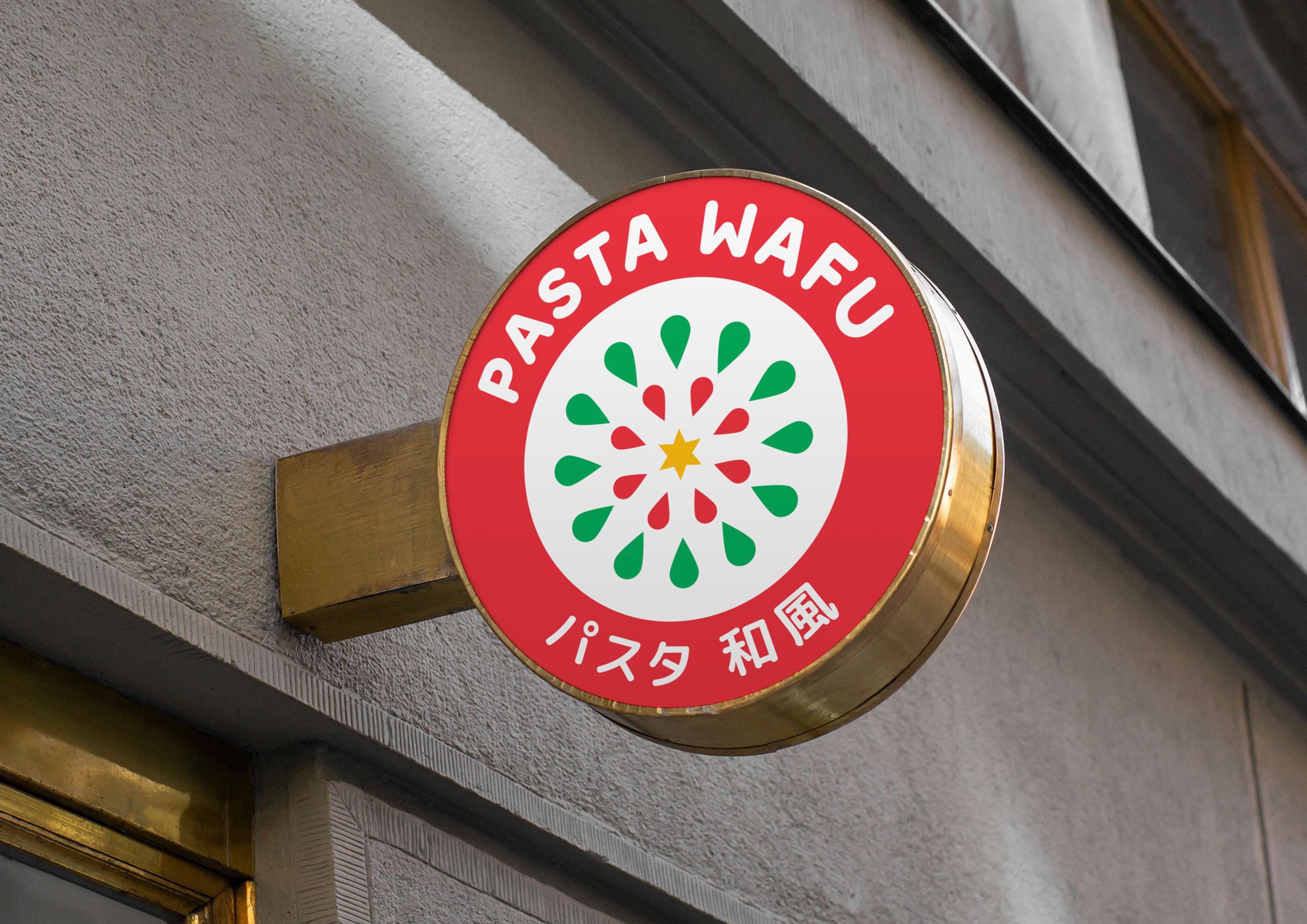
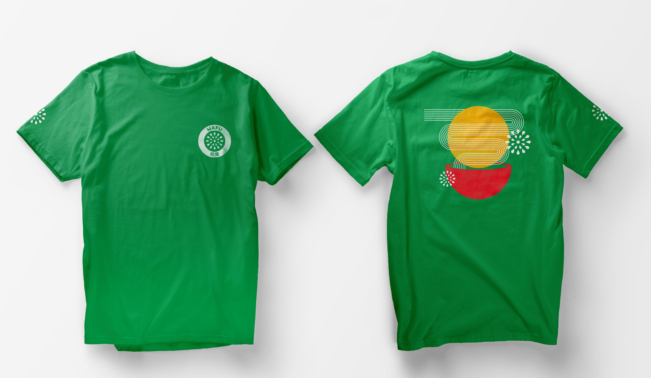
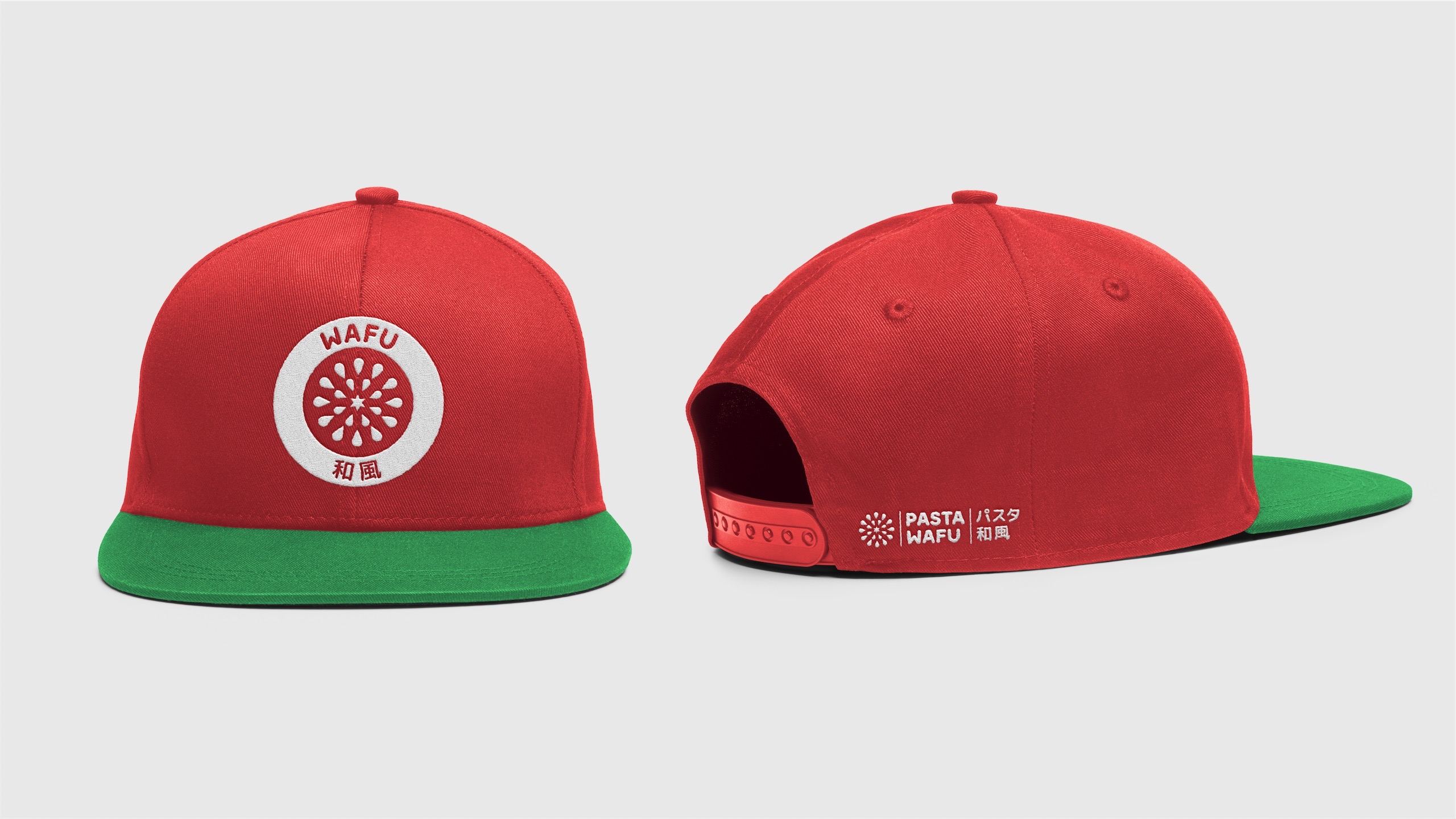
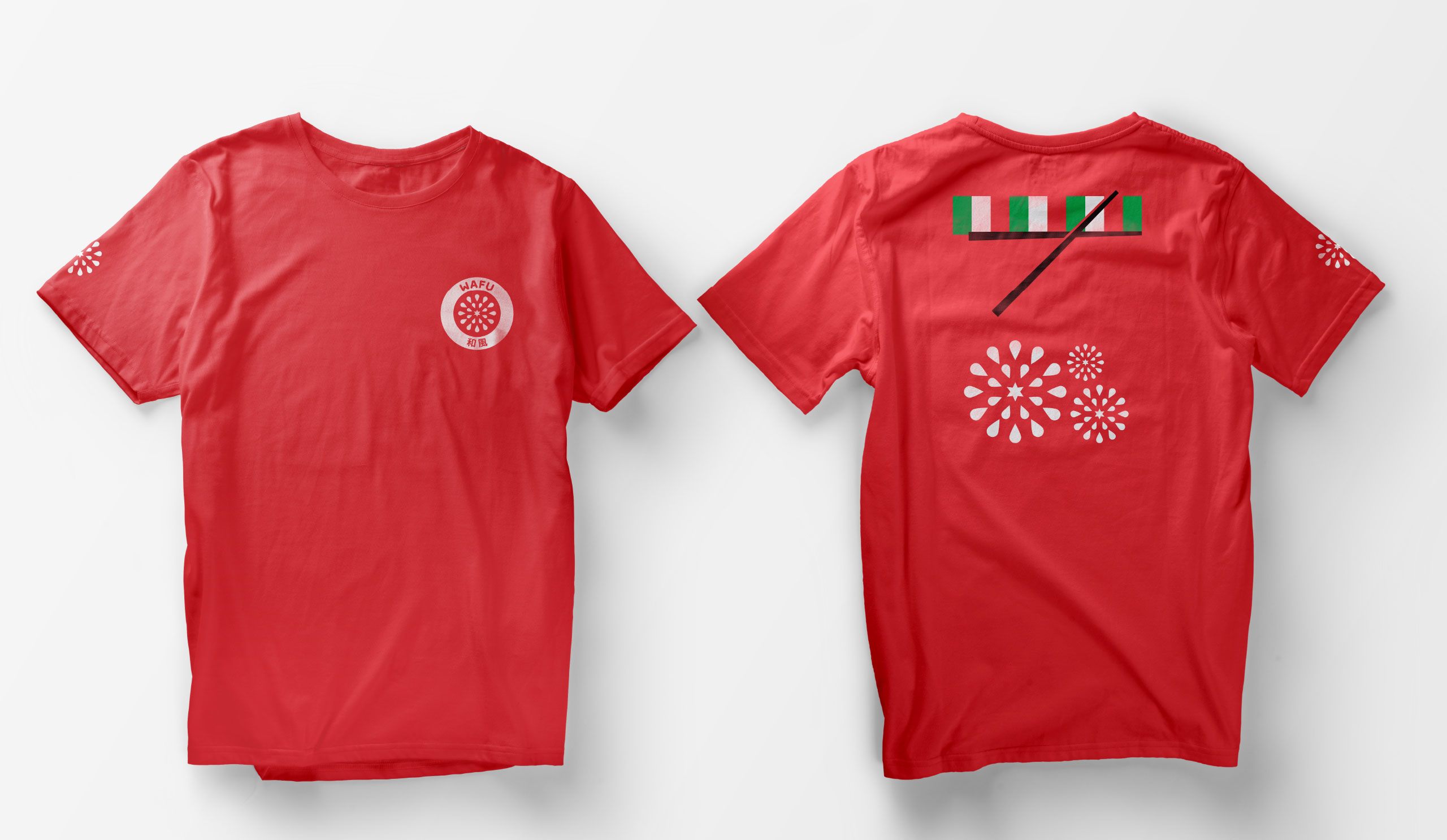
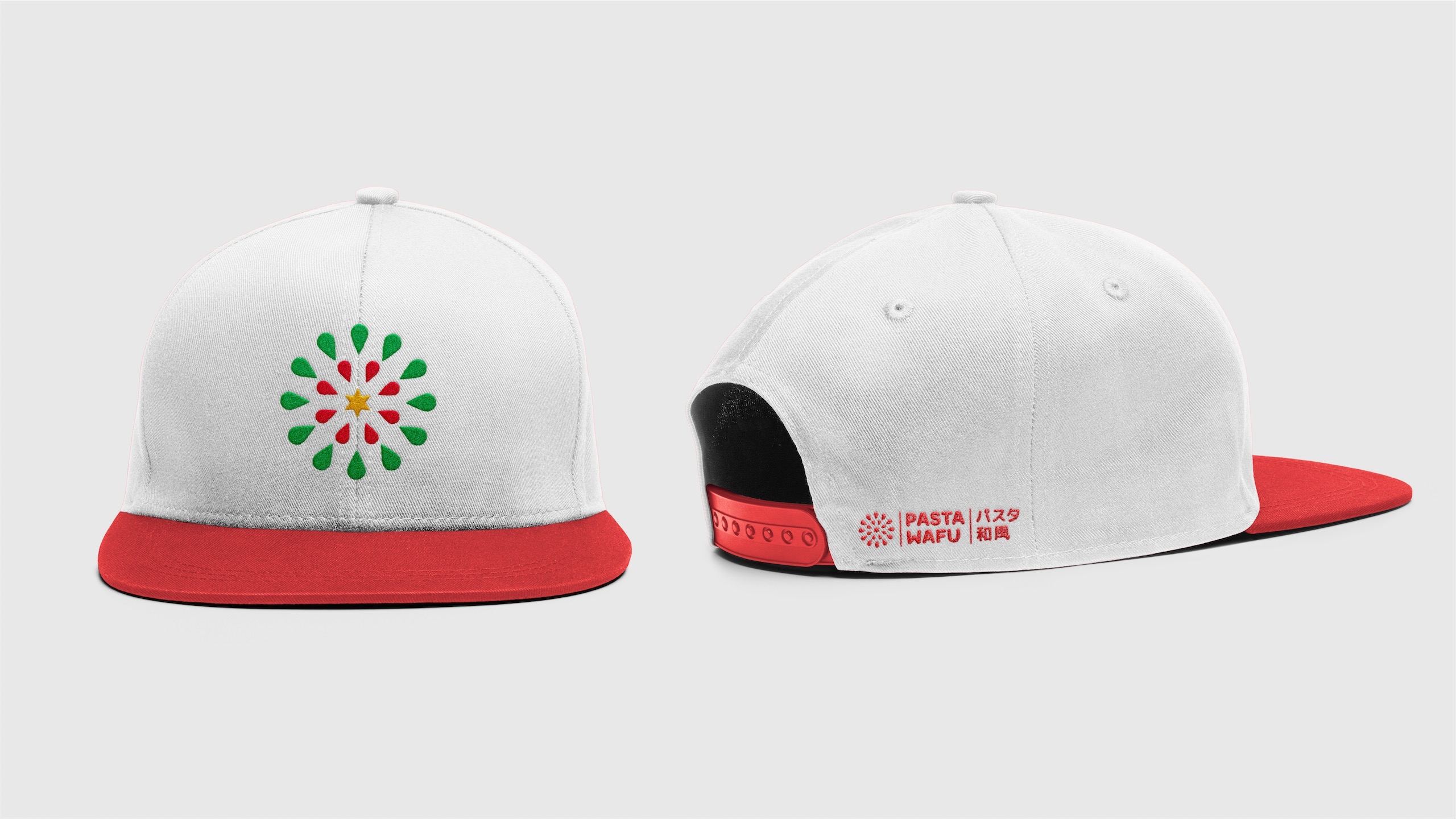
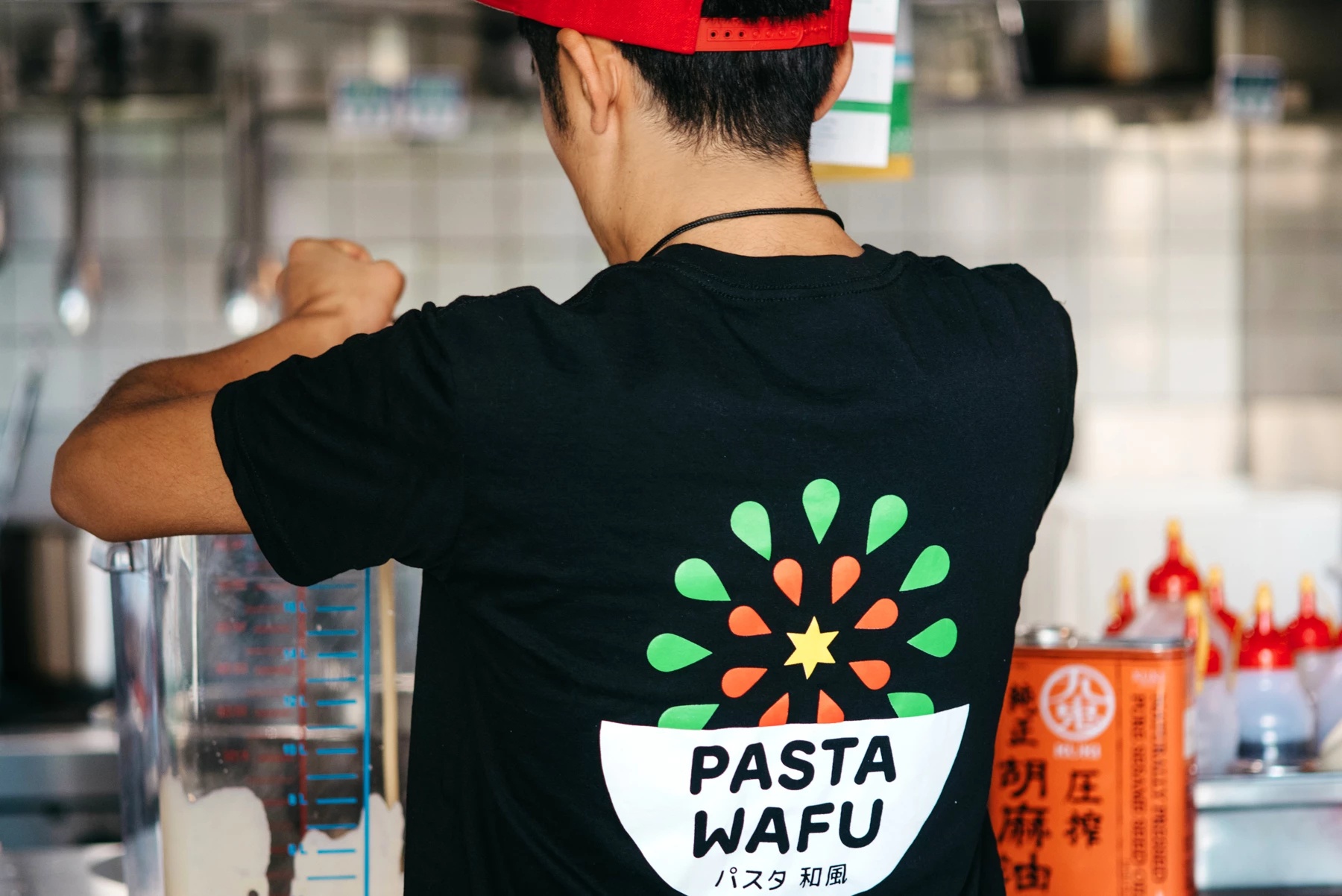
We were approached to create Pasta Wafu’s brand identity. From the outset, we wanted to create a brand that harmoniously brings together the culture and flavours of both countries Japan and Italy. We wanted the brand to feel friendly, exciting and unique.
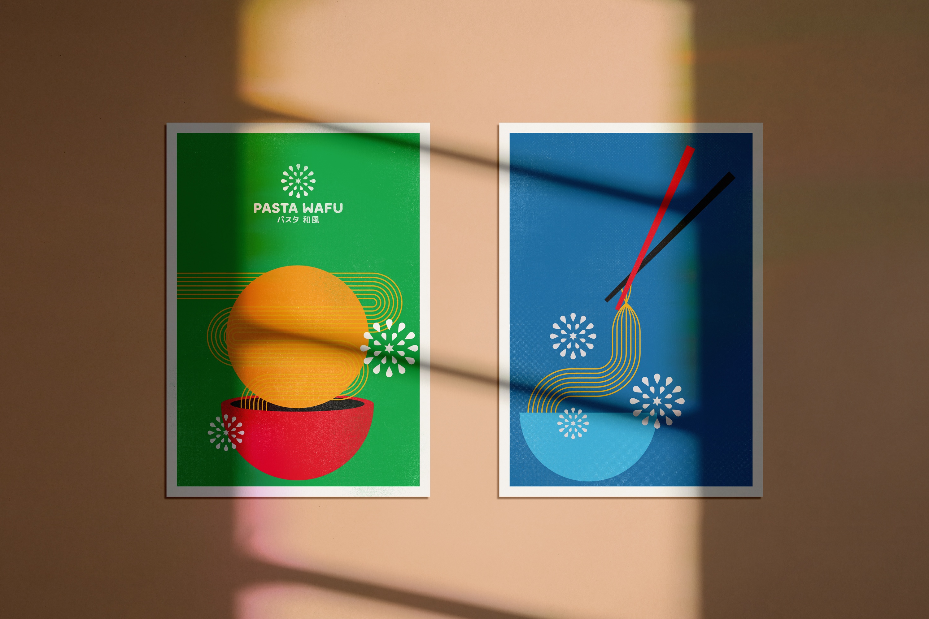
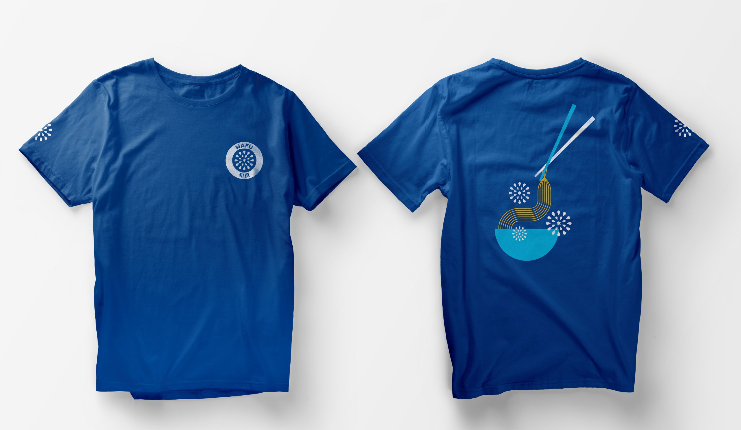
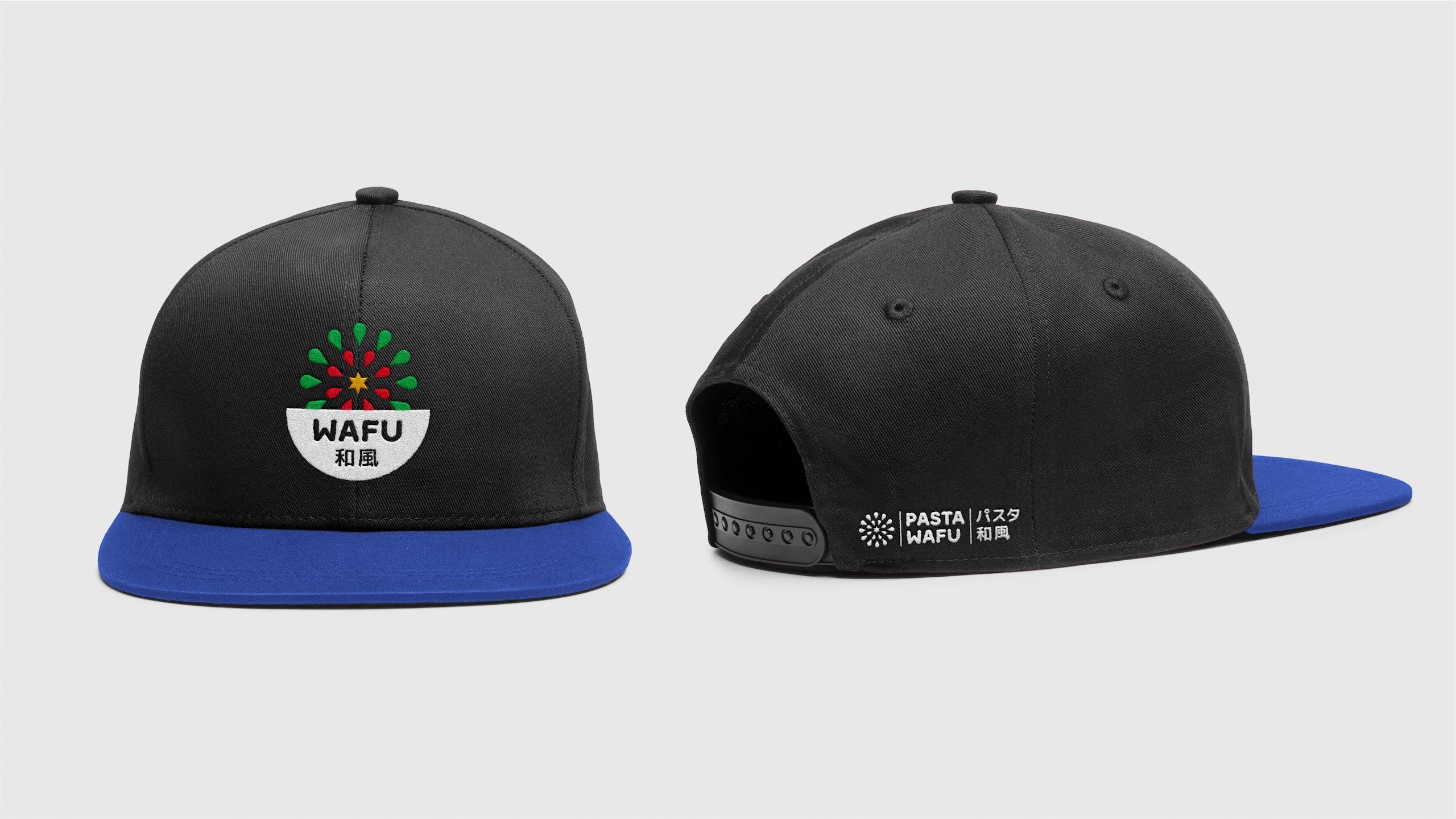
Inspired by vintage Japanese firework posters, we created a logo mark that reflects the explosion of different flavours created from the fusion of the two cuisines. We created a system where we could expand the logo mark to different firework variations to represent each dish/ingredient. This was supported by a series of poster illustrations and packaging. Paired with friendly rounded typography, and a colour palette that reflects the colours of both countries.
Services:
Branding, Creative Direction, Design,