Kizuna - Brand Identity
Sony Australia
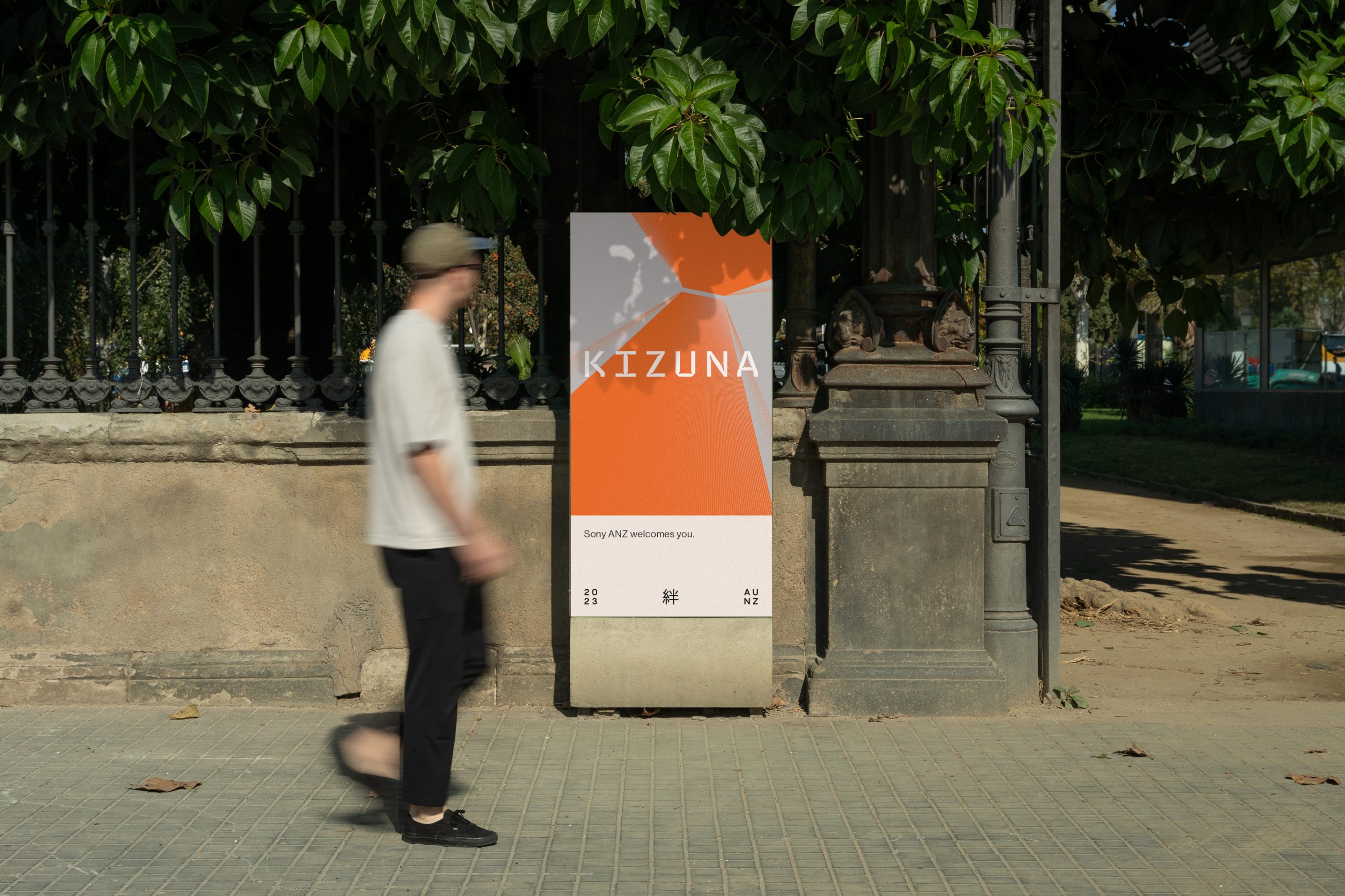
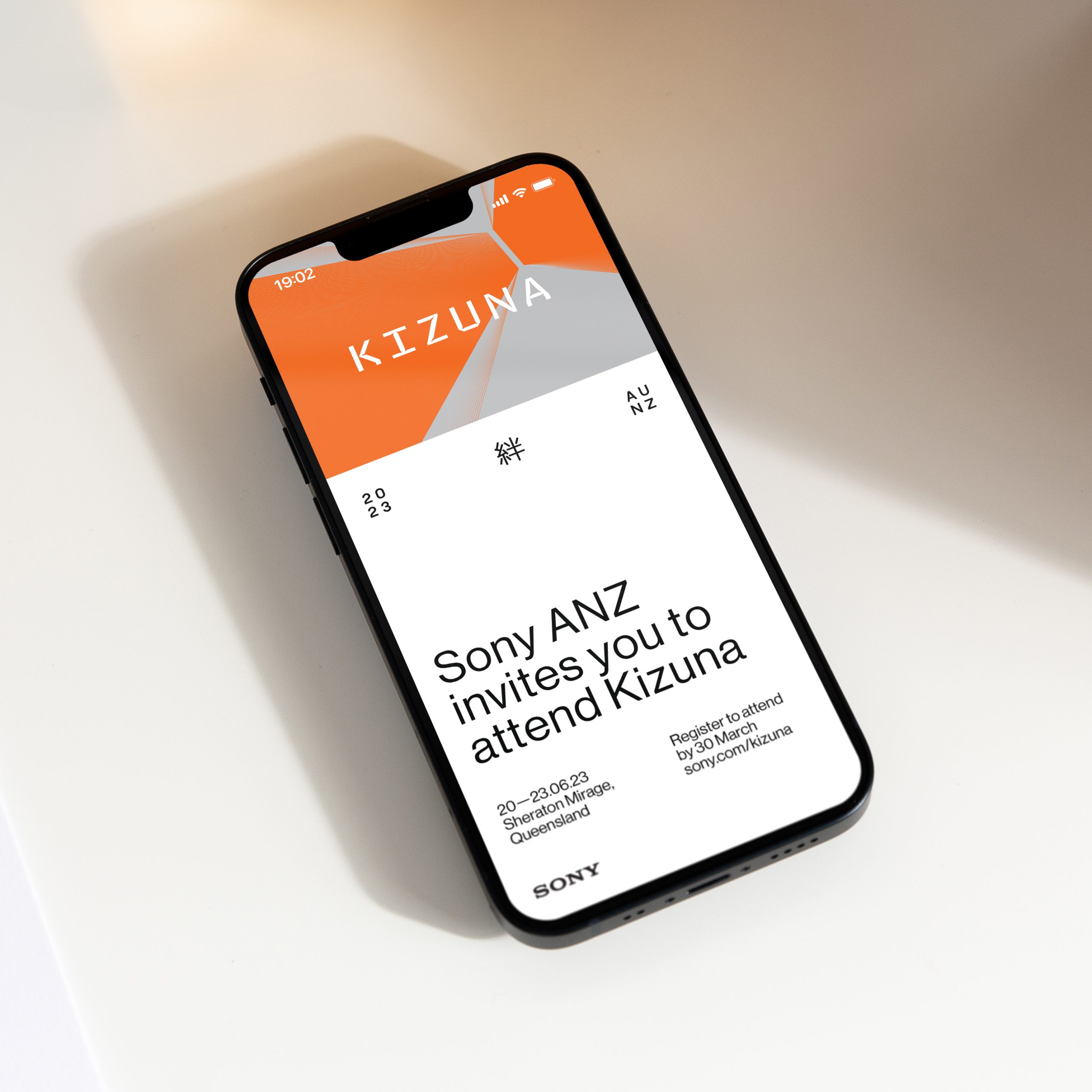
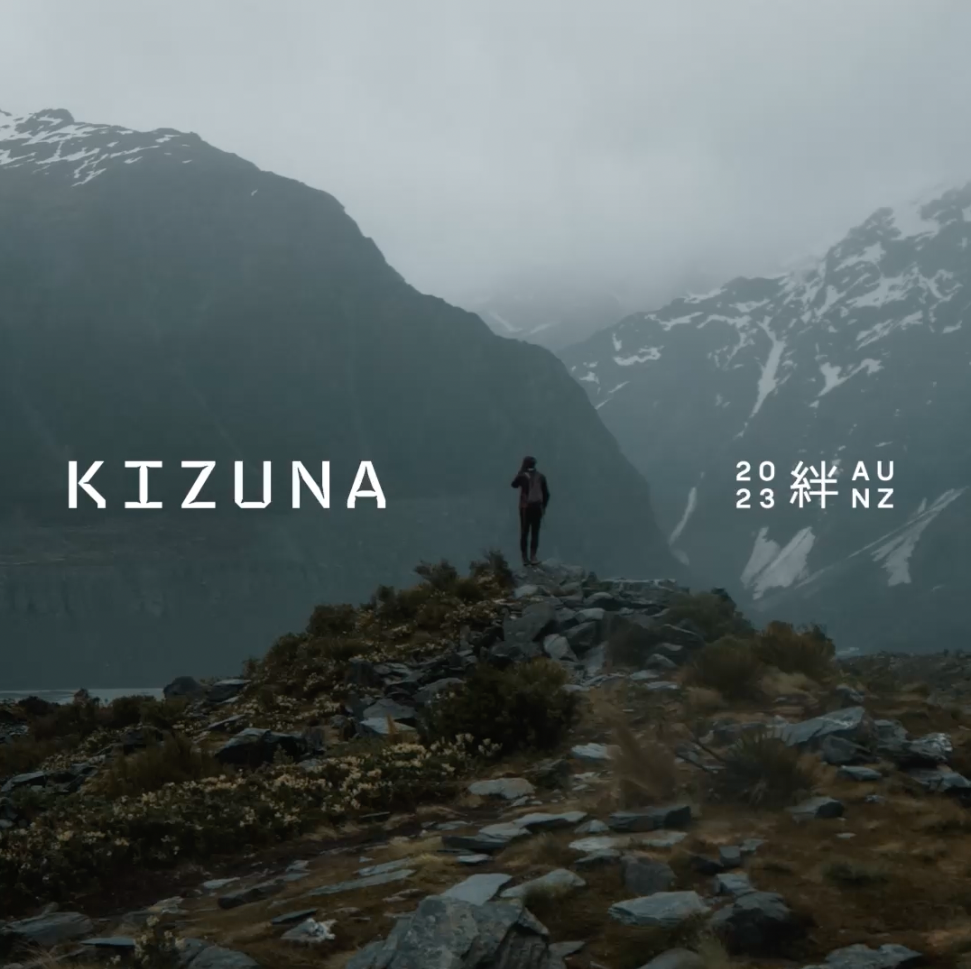
絆 Kizuna is a multi-day event run by Sony Australia. The invite-only event brings together Sony creators to connect, be inspired and strengthen their sense of community.
The Japanese word ‘kizuna’ means the bonds or connections between people. The written kanji of ‘kizuna’ was also to be included in the event name.
The typeface Brevier was selected which was designed by Riccardo Olocco for small type sizes. We found, however, that when used at larger scales, the exaggerated ink traps created beautiful shapes that highlighted the points of connection of each letterform. This tied in well with the meaning behind kizuna and also paired well visually with the kanji.
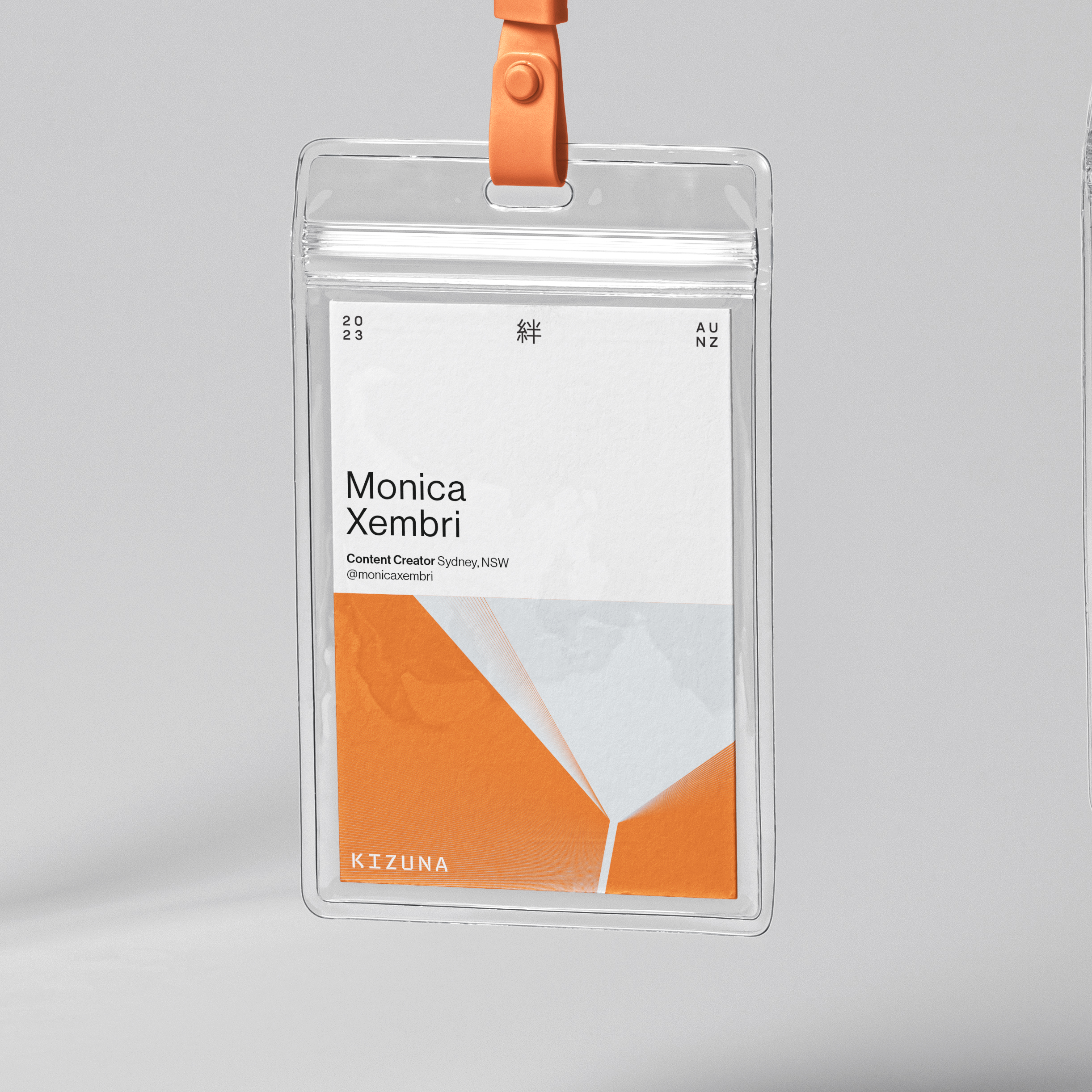
Kizuna - Brand Identity
Sony Australia
絆 Kizuna is a multi-day event run by Sony Australia. The invite-only event brings together Sony creators to connect, be inspired and strengthen their sense of community.
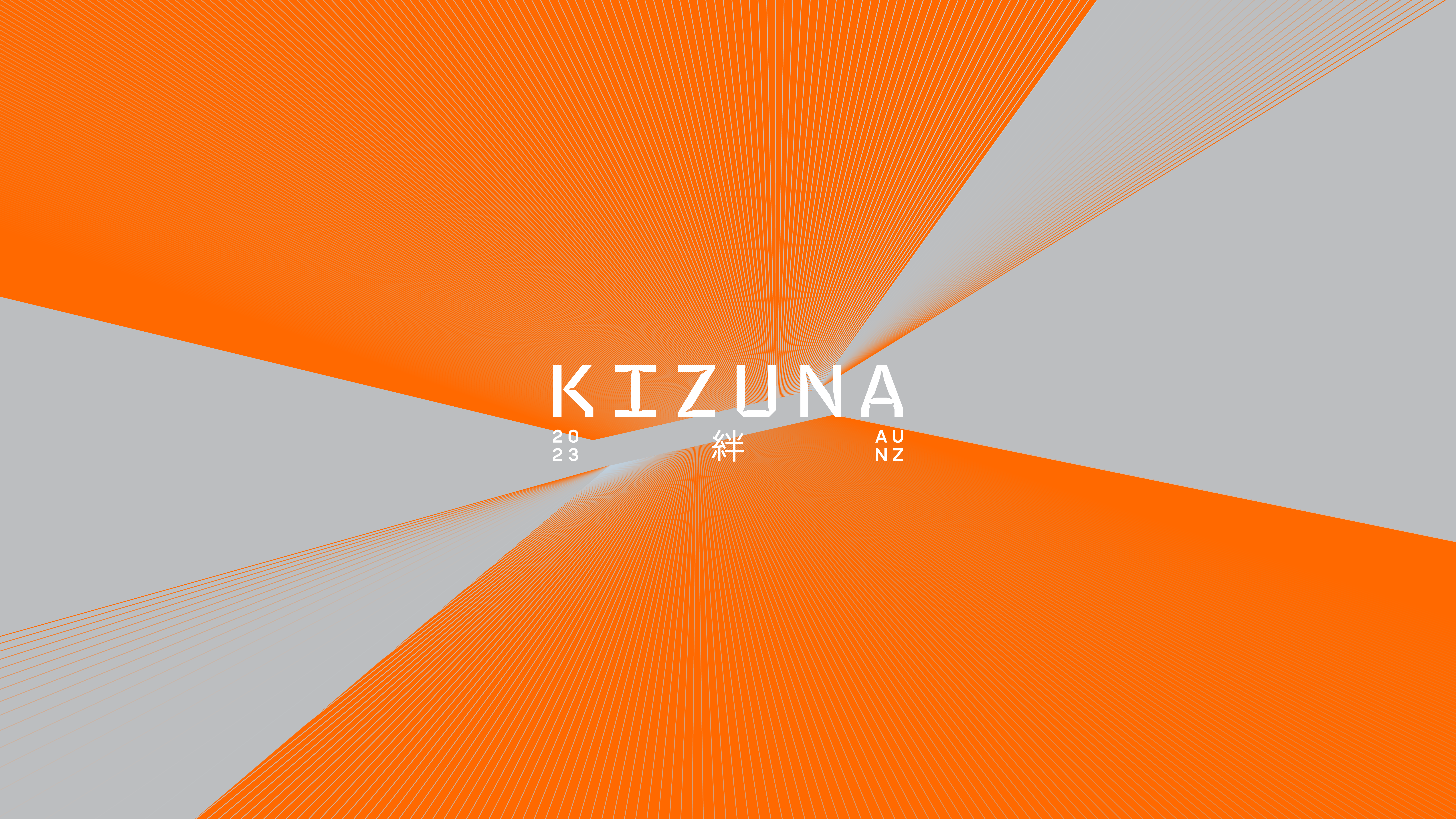
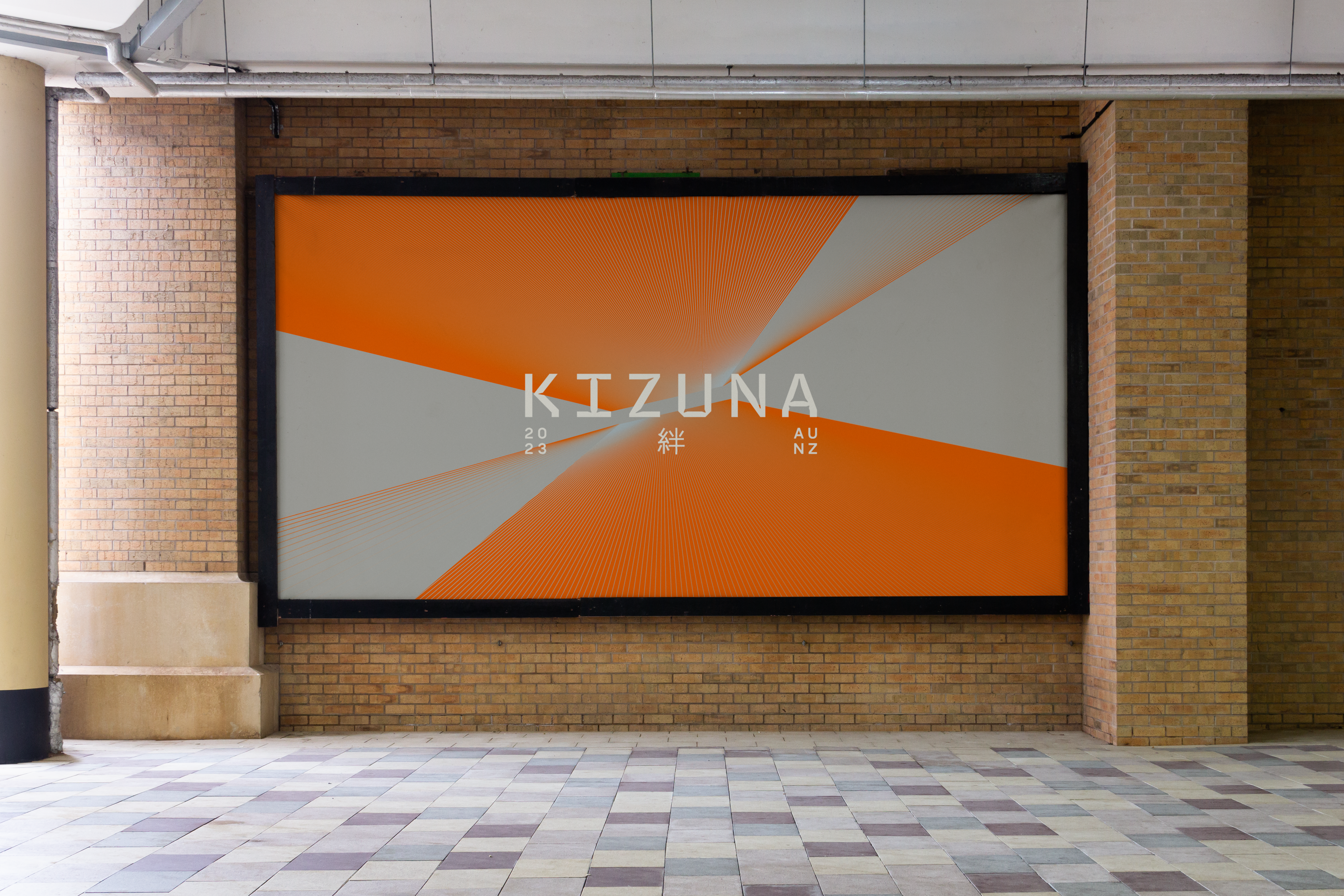
To evolve the identity, forms found within the logotype were scaled up and positioned to be pointing towards each other.
This hints at ‘kizuna’ as it suggests a longing for a bond or connection. The cinnabar orange which exists in Sony’s Digital Imaging line was incorporated and paired with a subdued light grey. The rays that interact with these shapes are a subtle nod to lighting.